Maxx Power is a concept branding project for a performance training app designed to help users build strength, discipline, endurance, and consistency through structured workout programs. Inspired by the mentality of boxing, the brand is rooted in the mindset of high-level performance — resilience, repetition, focus, and controlled power.
SERVICES
Brand Identity
UI Design
Digital Ads
Brand Guidelines
CHALLENGE
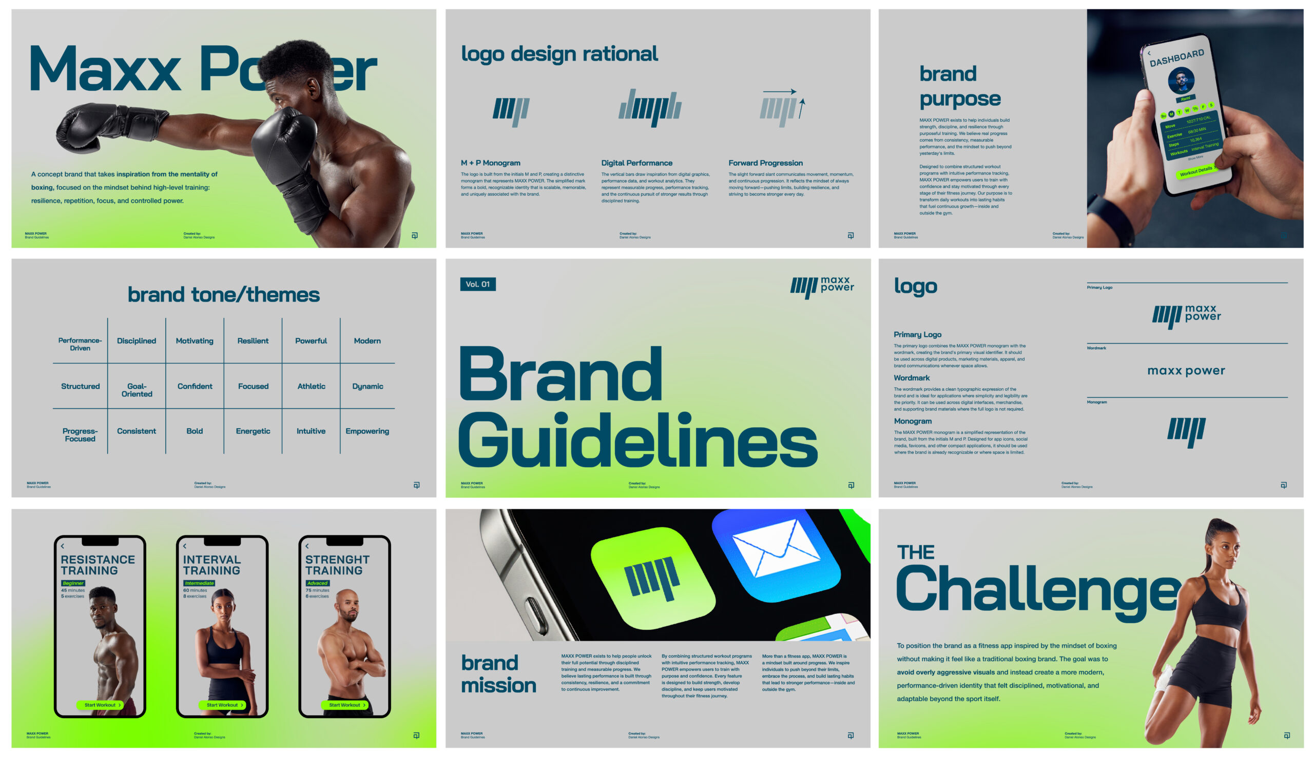
The challenge was to position the brand as a fitness app inspired by the mindset of boxing without making it feel like a traditional boxing brand. The goal was to avoid overly aggressive visuals and instead create a more modern, performance-driven identity that felt disciplined, motivational, and adaptable beyond the sport itself.
brand
strategy
The strategy focused on positioning MAXX POWER around the mindset and training philosophy of boxing. While the app incorporates many of the workouts and conditioning methods commonly used by boxers, the focus was on the universal qualities those training programs develop, which are: discipline, consistency, resilience, and continuous self-improvement.
01
AUDIENCE
Adults who want to build strength, improve conditioning, and stay consistent with their fitness goals. They value structured workouts that challenge them physically while supporting discipline, confidence, and long-term progress.
02
POSITIONING
A performance-driven fitness platform that brings the discipline and mindset of boxing into accessible training experiences designed to help people become stronger physically and mentally.
03
CREATIVE DIRECTION
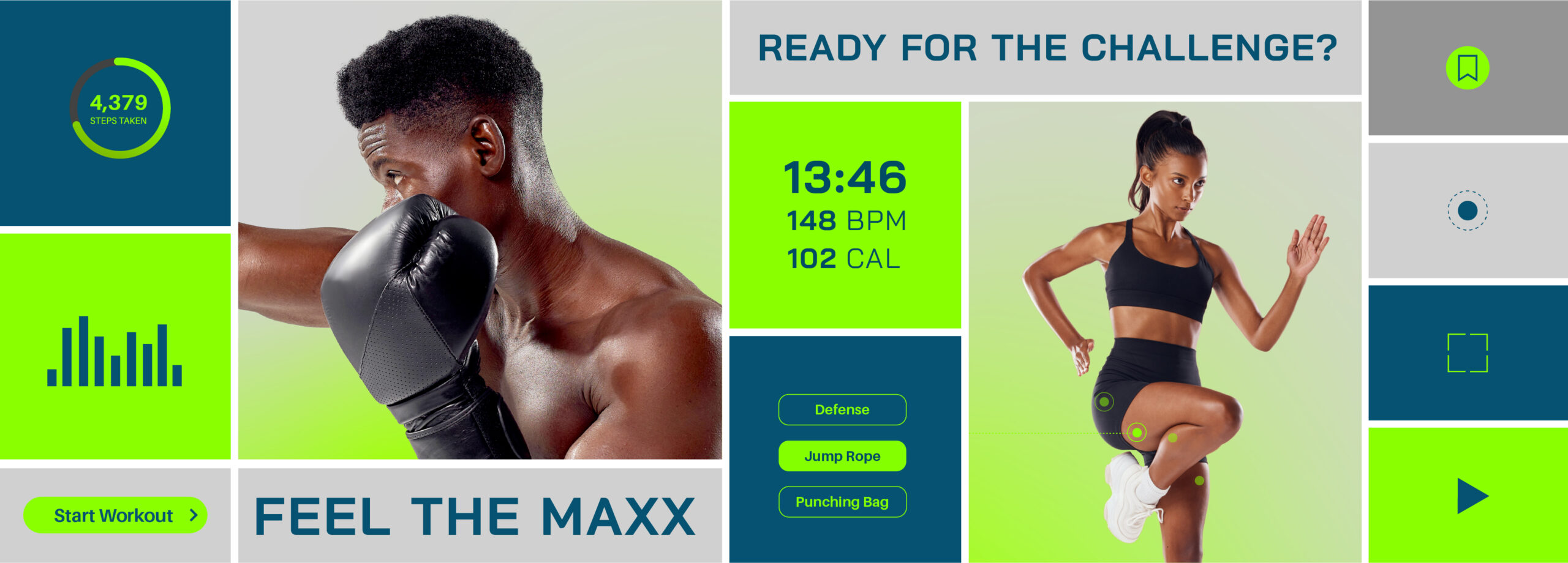
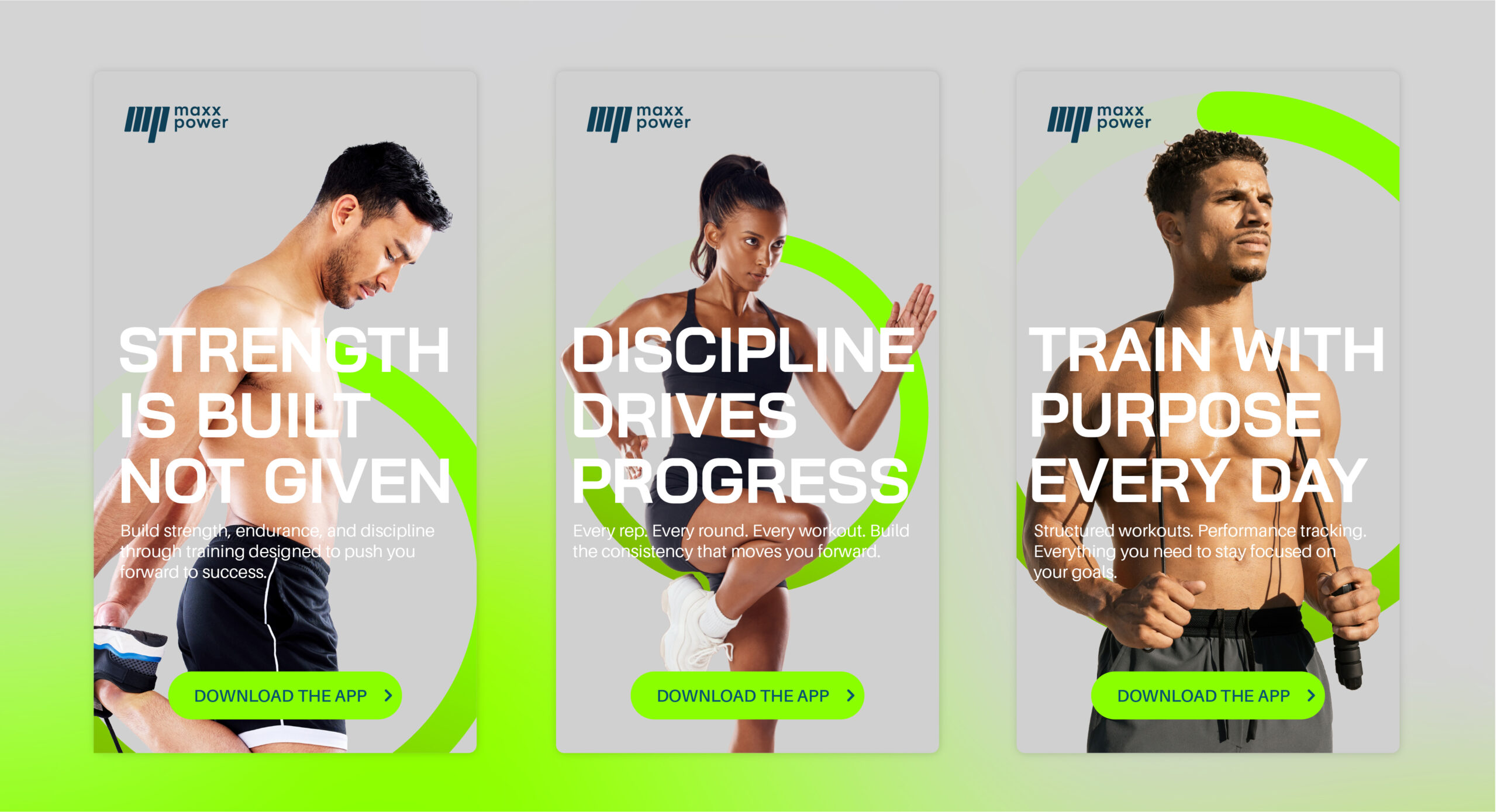
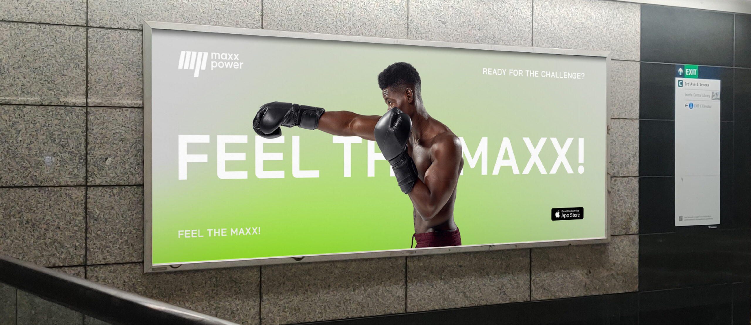
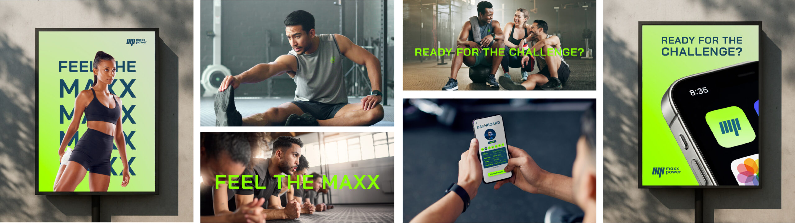
Bold, athletic, and performance-driven. Combining the intensity and movement of boxing with a modern digital fitness aesthetic. High-contrast typography, electric green accents, dynamic imagery.
04
BRAND PILLARS
Discipline
Progress
Resilience
Empowerment
visual
identity
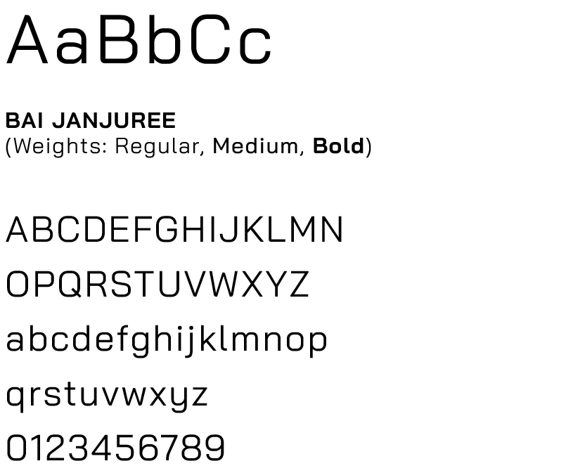
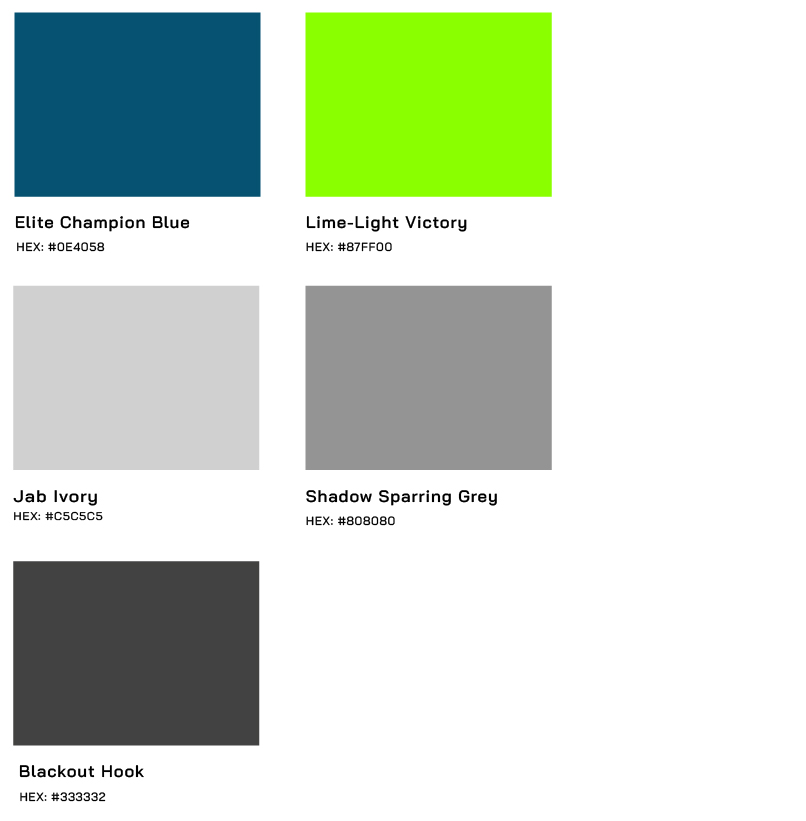
The MAXX POWER identity translates the discipline and intensity of boxing into a modern fitness brand built around personal progress. The bold, condensed mark draws inspiration from movement and impact, while clean typography and a high-contrast color system give the brand a confident, performance-driven feel. Electric green brings energy and momentum to the system, balanced by deep blue and neutral tones that keep the identity focused and approachable beyond the boxing space.
TYPOGRAPHY
COLOR SYSTEM
PRIMARY LOGO
WORDMARK
LOGO MARK
LOGO DESIGN RATIONAL
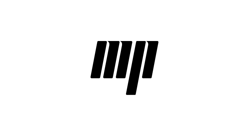
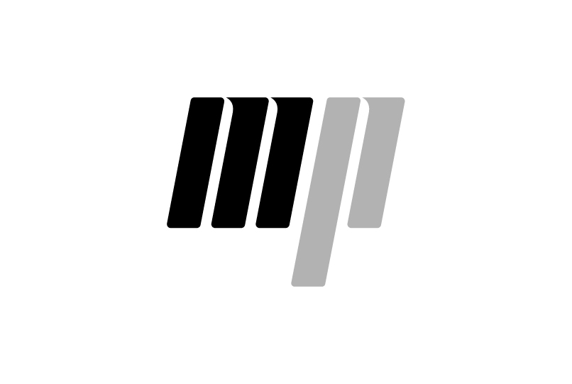
M + P monogram
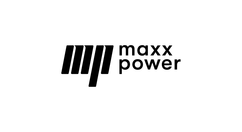
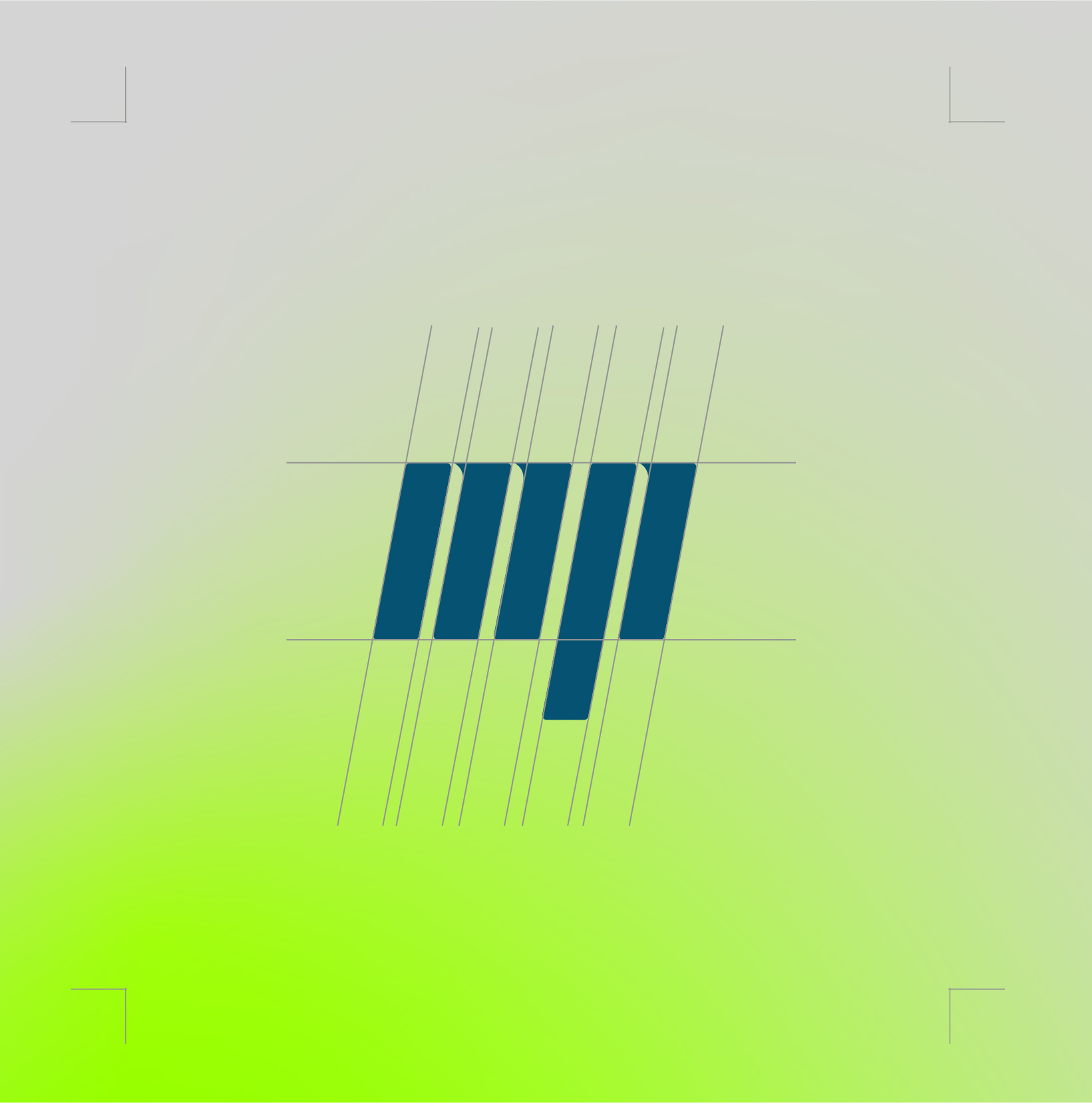
The logo is built from the initials M and P, creating a distinctive monogram that represents MAXX POWER. The simplified mark forms a bold, recognizable identity that is scalable, memorable, and uniquely associated with the brand.
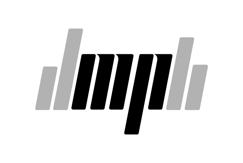
digital performance
The vertical bars draw inspiration from digital graphics, performance data, and workout analytics. They represent measurable progress, performance tracking, and the continuous pursuit of stronger results through disciplined training.
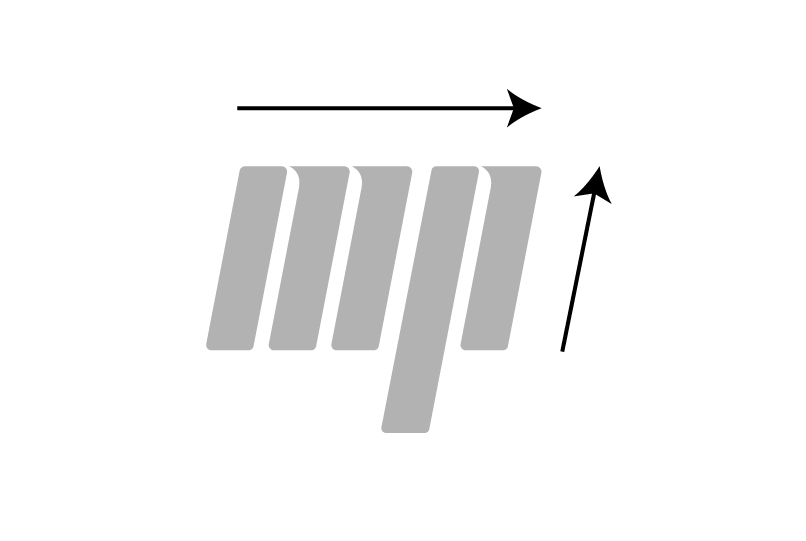
forward progression
The slight forward slant communicates movement, momentum, and continuous progression. It reflects the mindset of always moving forward—pushing limits, building resilience, and striving to become stronger every day.
UI Design
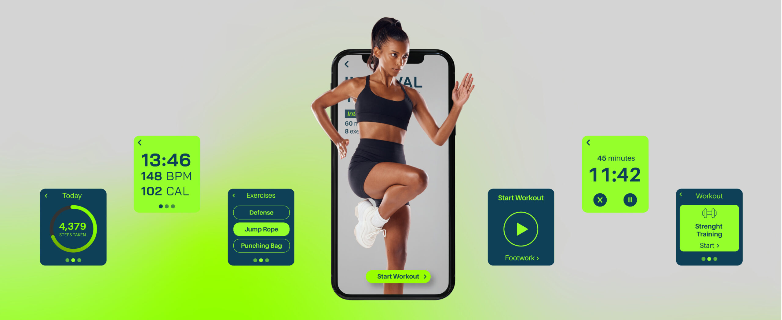
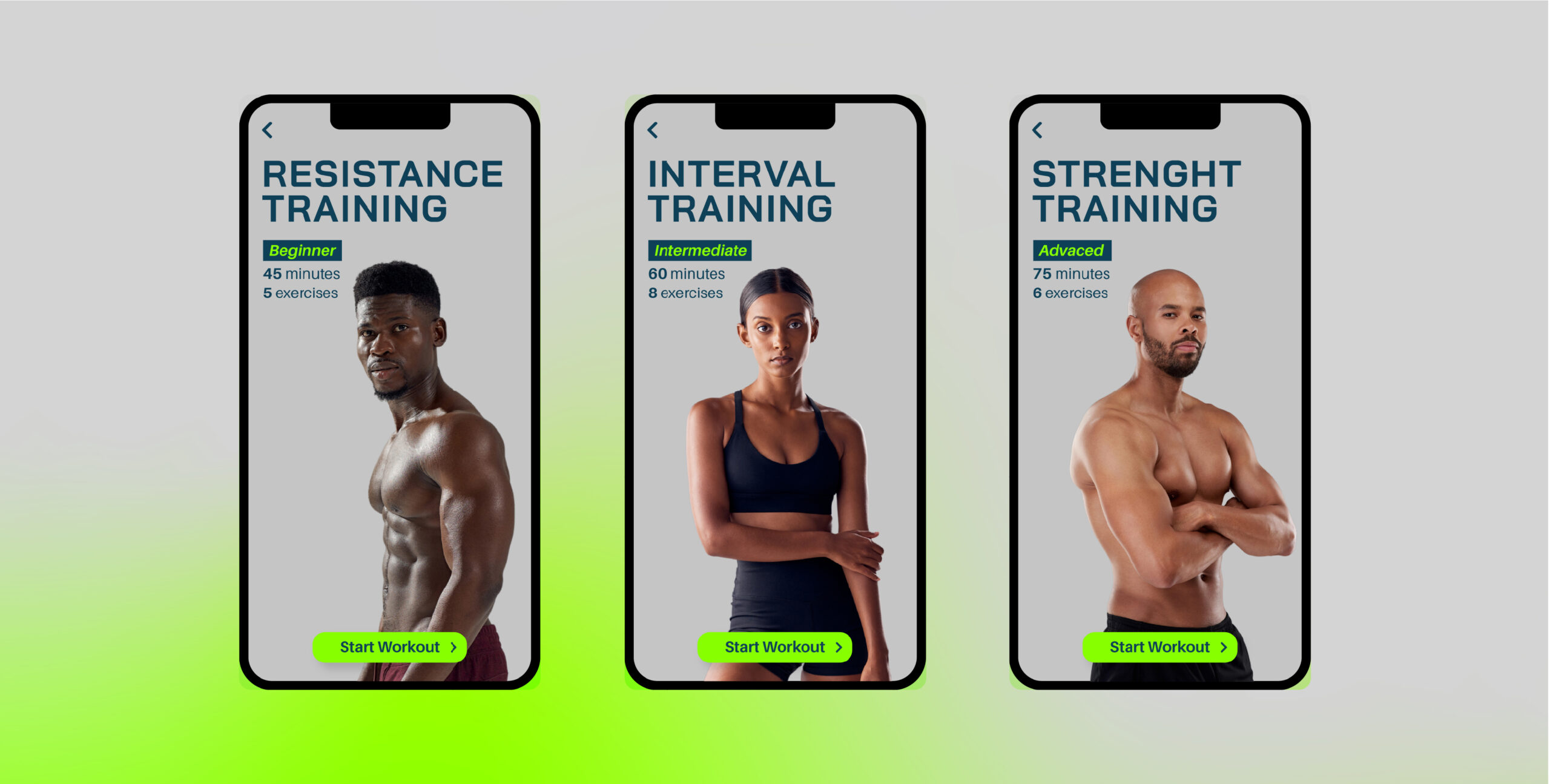
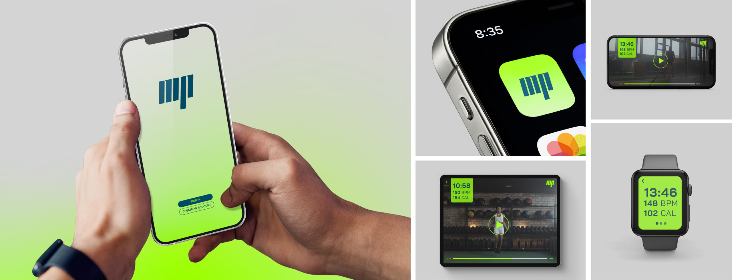
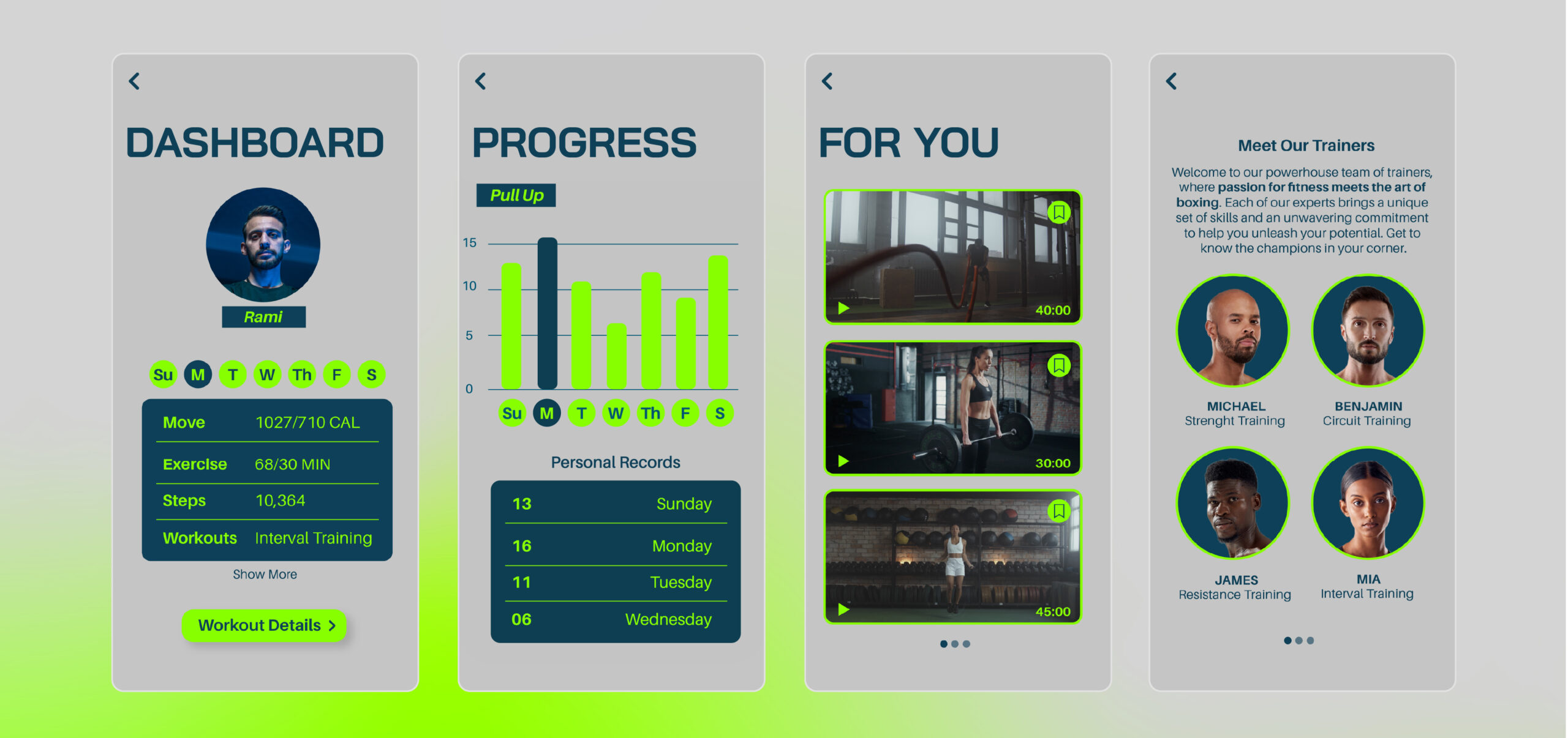
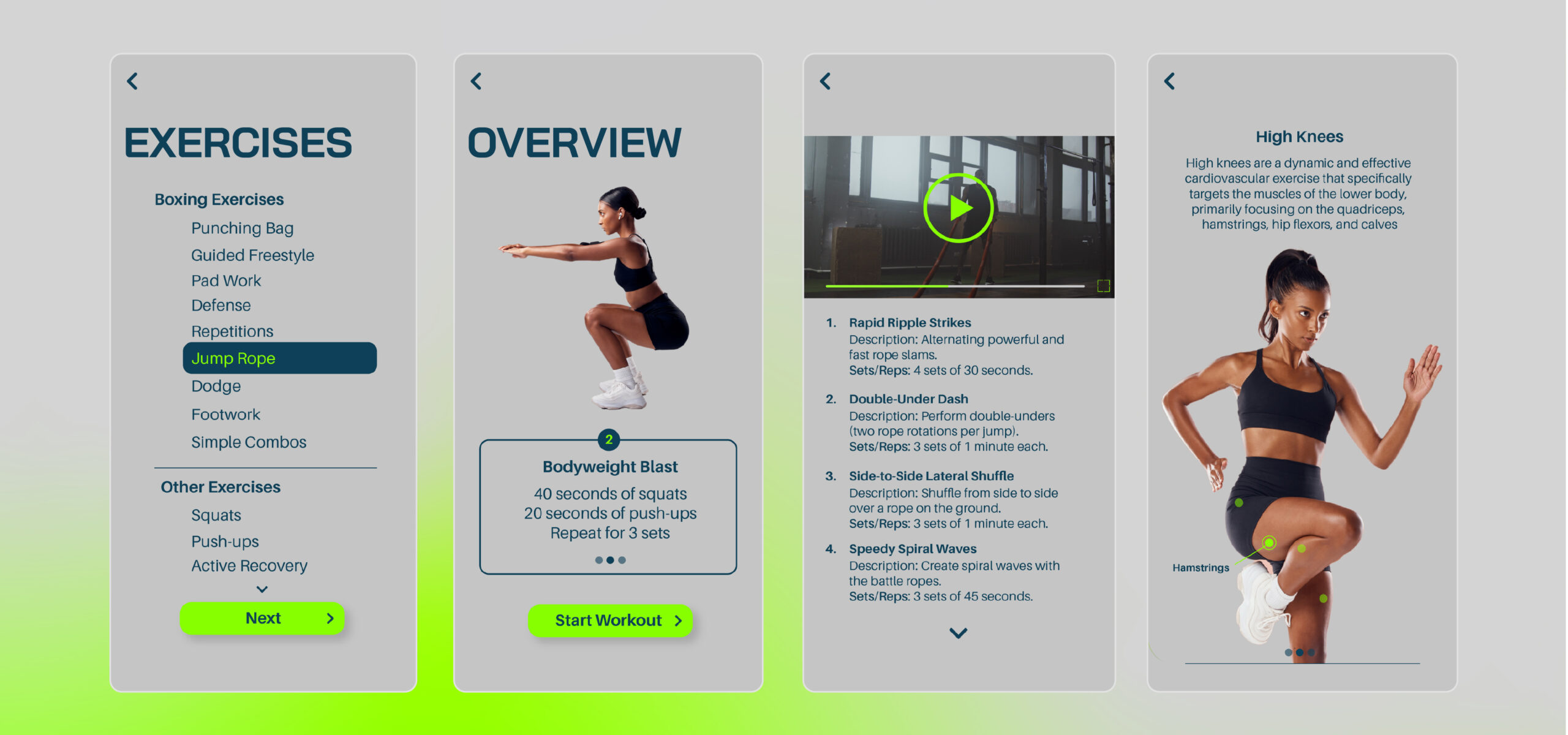
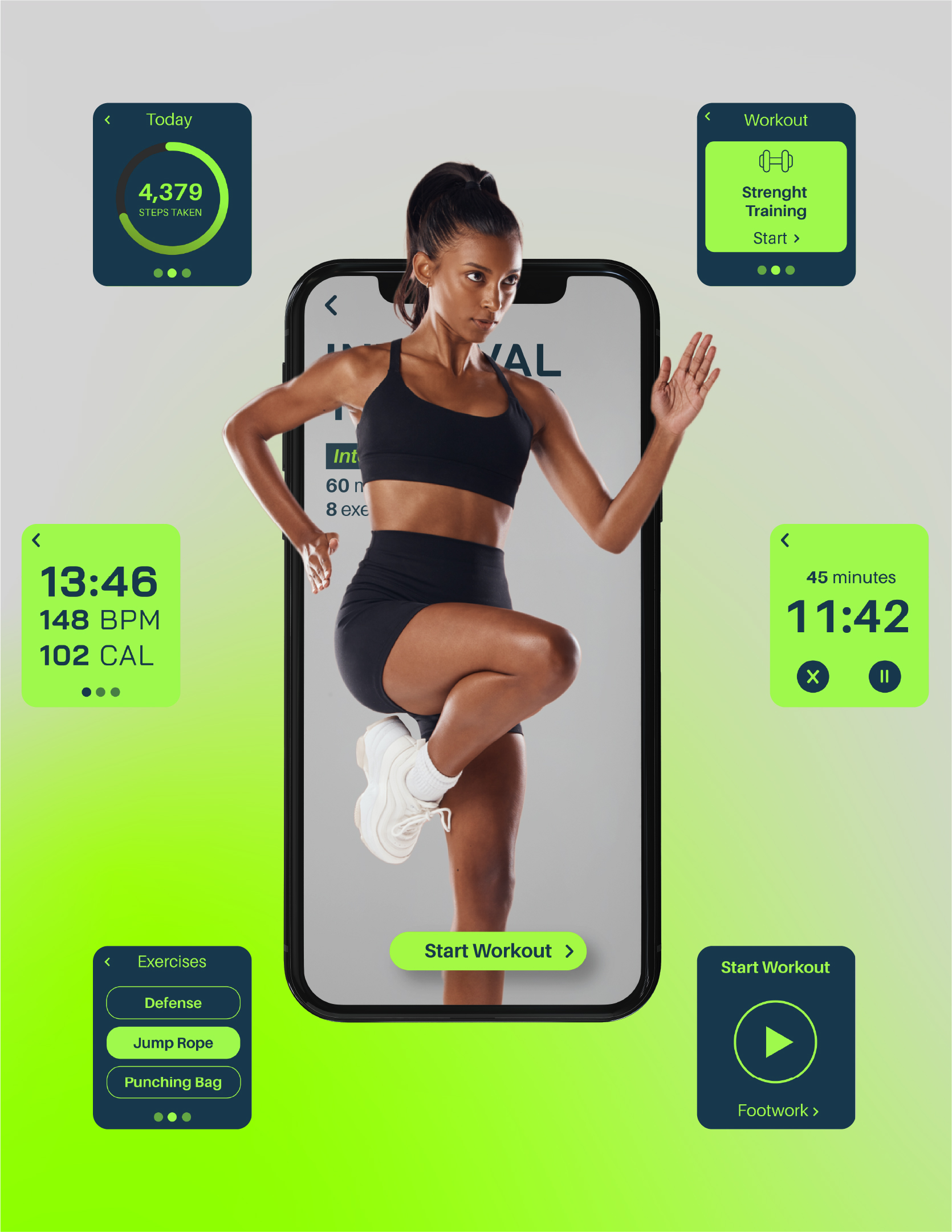
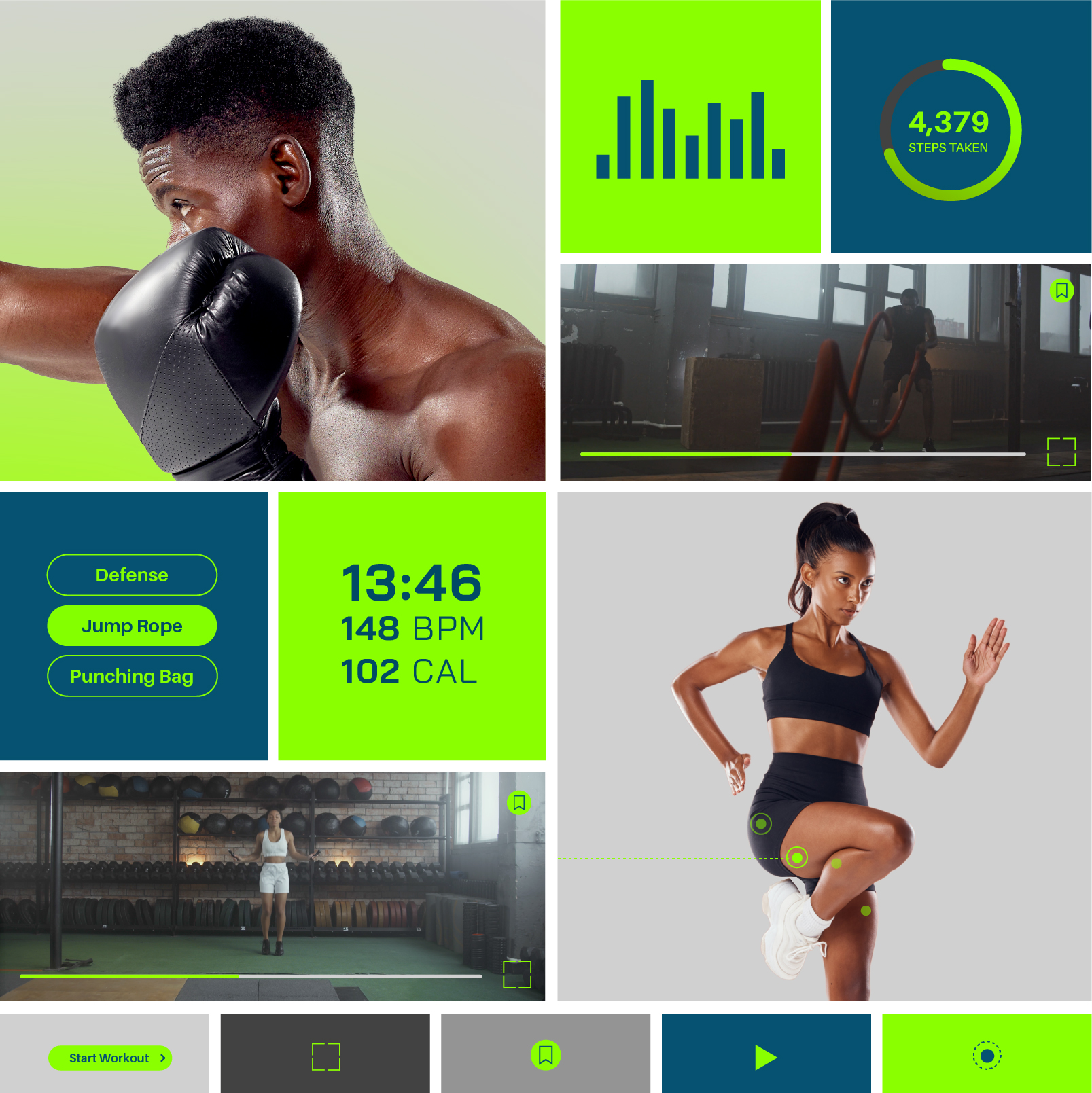
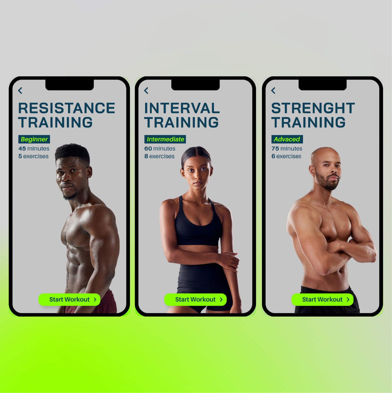
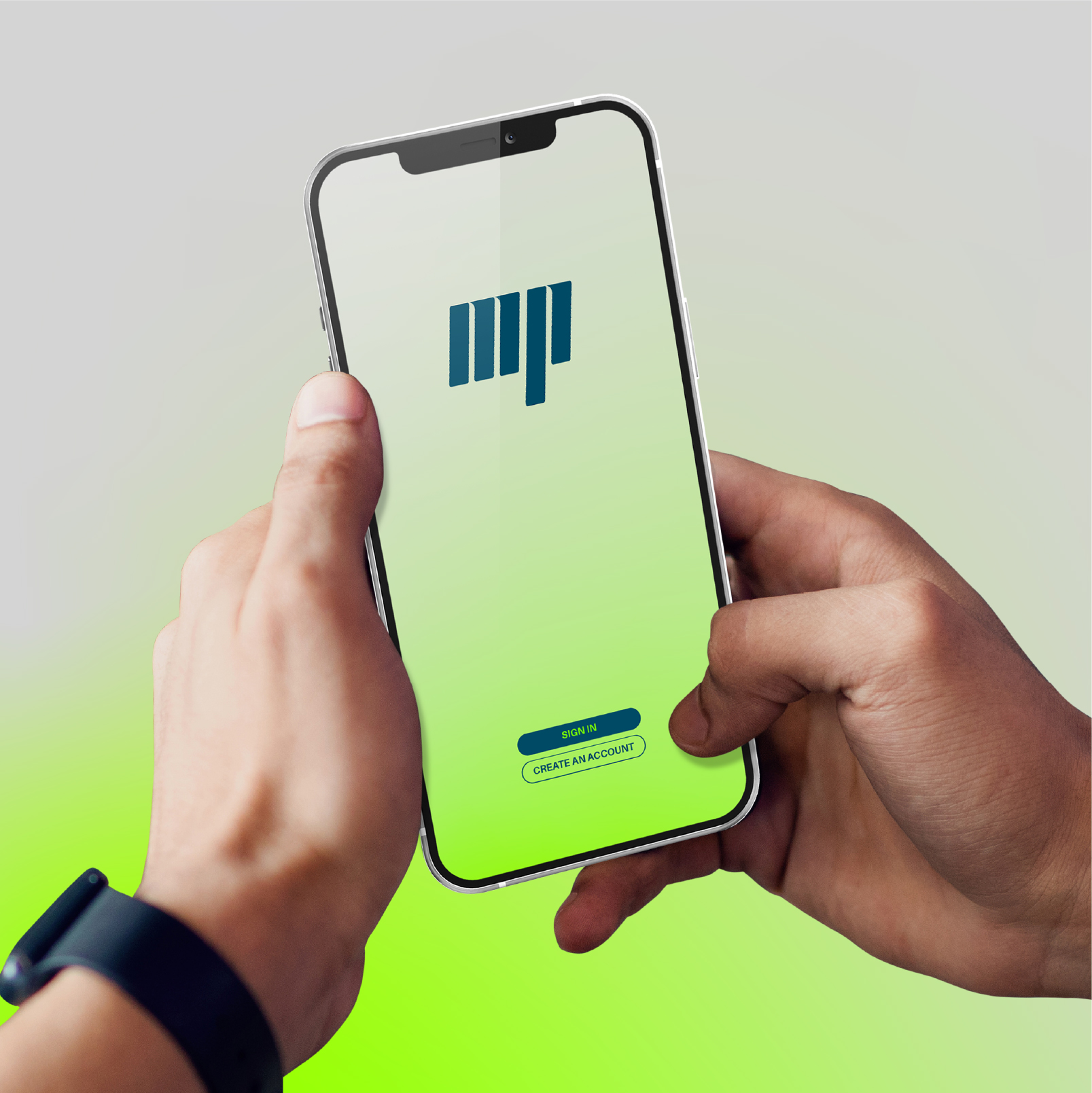
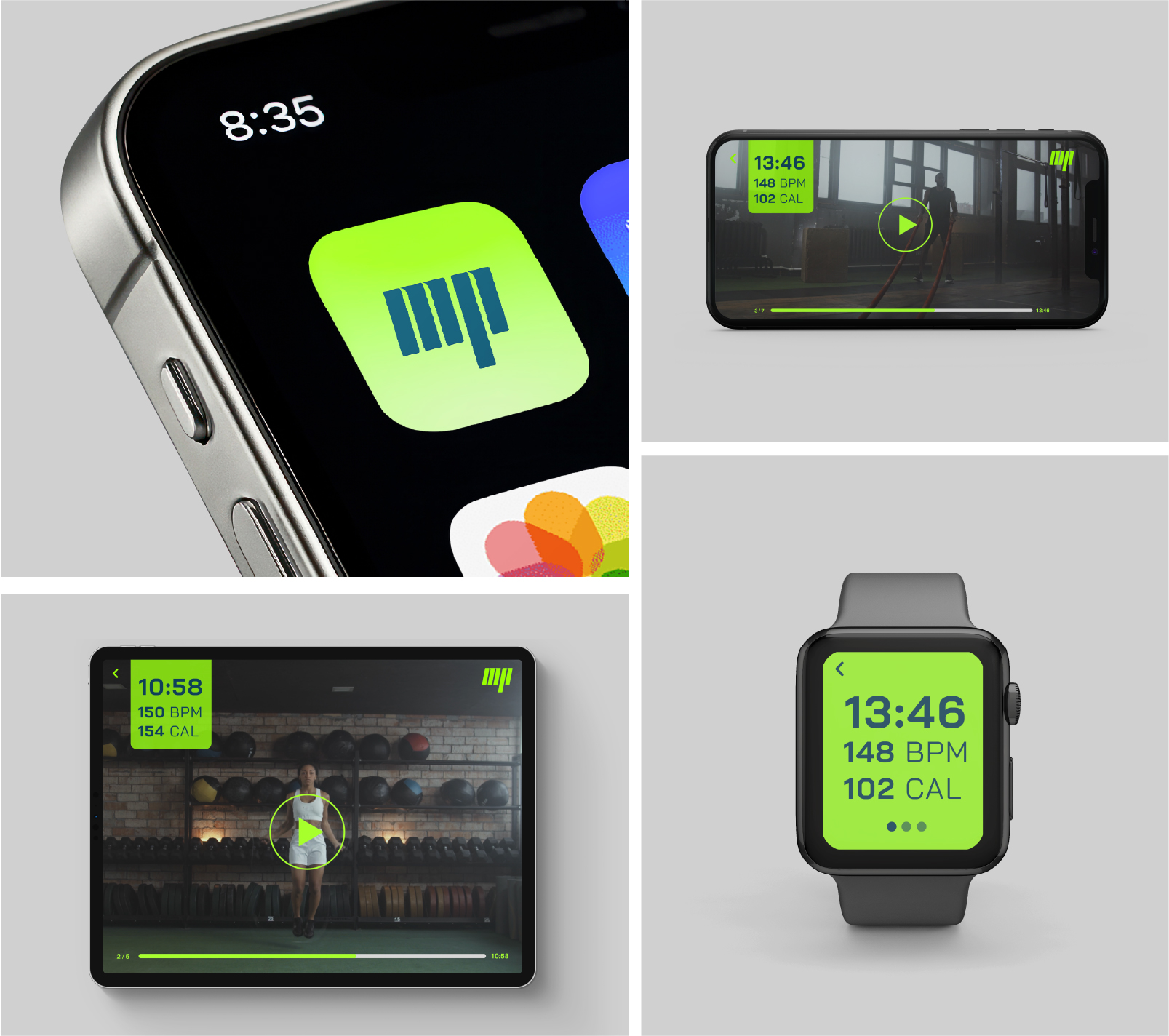
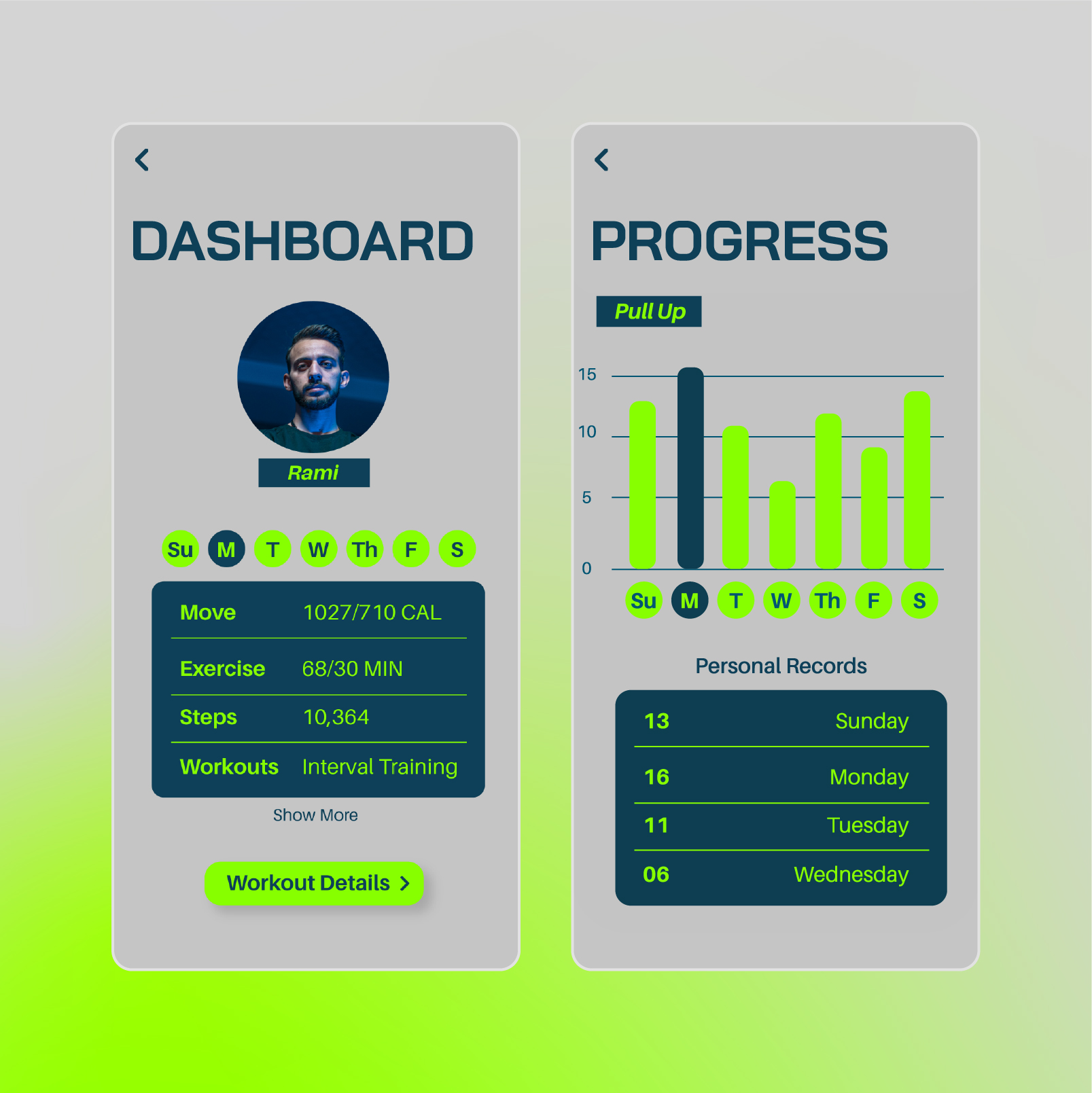
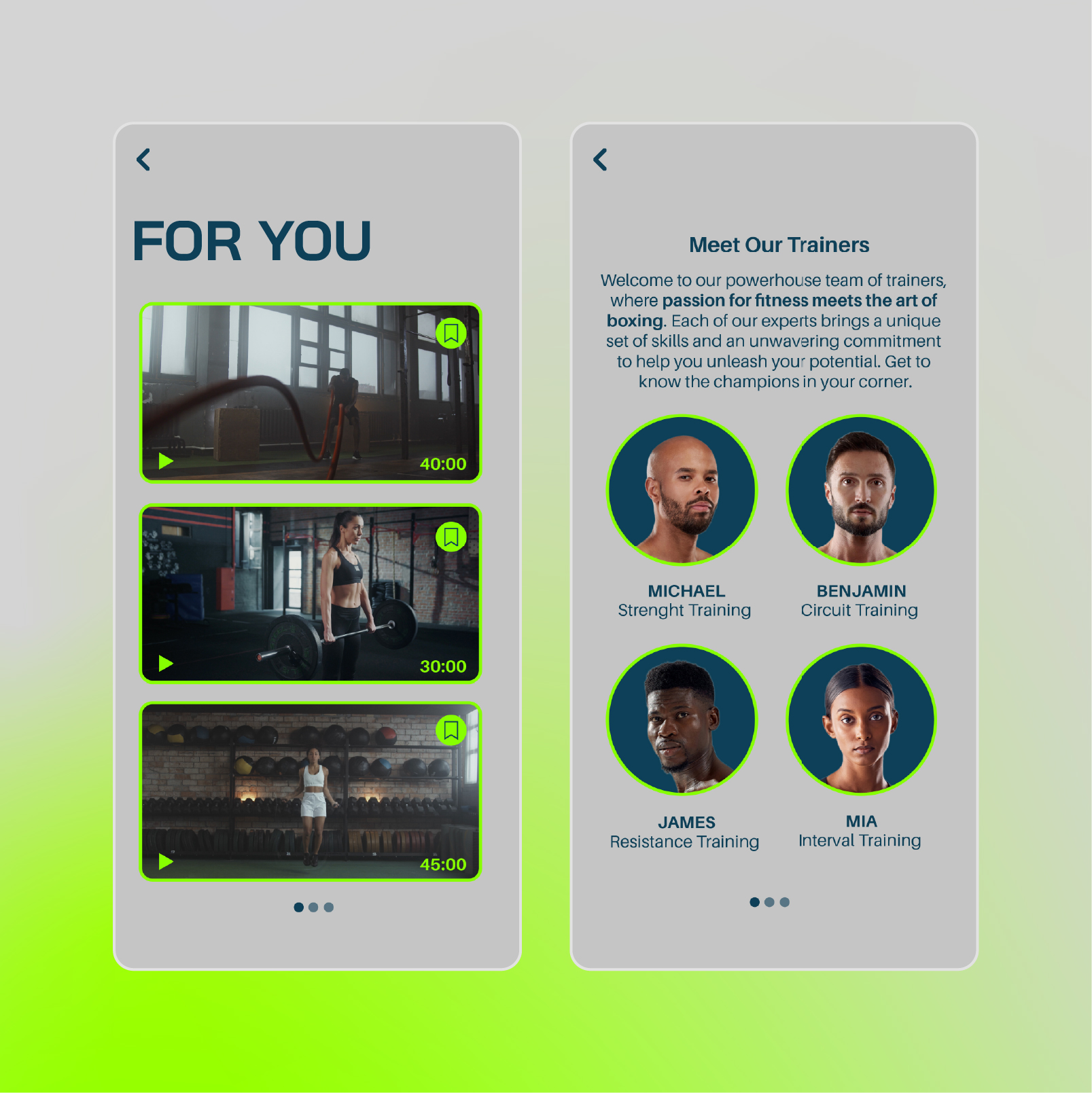
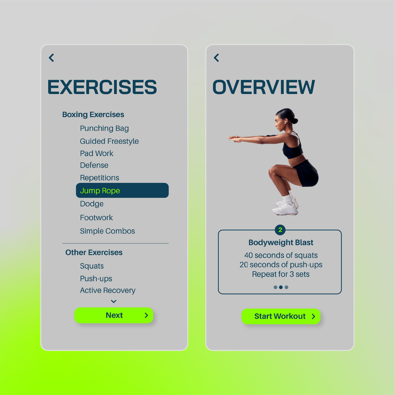
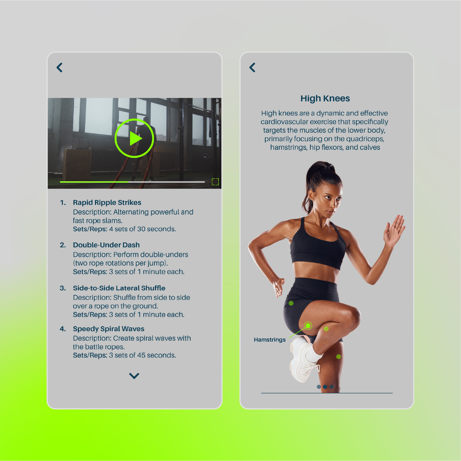
The experience needed to reflect the brand identity. Athletic, disciplined, and performance-driven, while still feeling modern and technology-focused.
Maxx Power is a concept branding project for a performance training app designed to help users build strength, discipline, endurance, and consistency through structured workout programs. Inspired by the mentality of boxing, the brand is rooted in the mindset of high-level performance — resilience, repetition, focus, and controlled power.
SERVICES
Brand Identity
UI Design
Digital Ads
Brand Guidelines
CHALLENGE
The challenge was to position the brand as a fitness app inspired by the mindset of boxing without making it feel like a traditional boxing brand. The goal was to avoid overly aggressive visuals and instead create a more modern, performance-driven identity that felt disciplined, motivational, and adaptable beyond the sport itself.
brand
strategy
The strategy focused on positioning MAXX POWER around the mindset and training philosophy of boxing. While the app incorporates many of the workouts and conditioning methods commonly used by boxers, the focus was on the universal qualities those training programs develop, which are: discipline, consistency, resilience, and continuous self-improvement.
01
AUDIENCE
Adults who want to build strength, improve conditioning, and stay consistent with their fitness goals. They value structured workouts that challenge them physically while supporting discipline, confidence, and long-term progress.
02
POSITIONING
A performance-driven fitness platform that brings the discipline and mindset of boxing into accessible training experiences designed to help people become stronger physically and mentally.
03
CREATIVE DIRECTION
Bold, athletic, and performance-driven. Combining the intensity and movement of boxing with a modern digital fitness aesthetic. High-contrast typography, electric green accents, dynamic imagery.
04
BRAND PILLARS
Discipline
Progress
Resilience
Empowerment
visual
identity
The MAXX POWER identity translates the discipline and intensity of boxing into a modern fitness brand built around personal progress. The bold, condensed mark draws inspiration from movement and impact, while clean typography and a high-contrast color system give the brand a confident, performance-driven feel. Electric green brings energy and momentum to the system, balanced by deep blue and neutral tones that keep the identity focused and approachable beyond the boxing space.
TYPOGRAPHY
COLOR SYSTEM
WORDMARK
PRIMARY LOGO
LOGO MARK
LOGO DESIGN RATIONAL
forward progression
The slight forward slant communicates movement, momentum, and continuous progression. It reflects the mindset of always moving forward—pushing limits, building resilience, and striving to become stronger every day.
digital performance
The vertical bars draw inspiration from digital graphics, performance data, and workout analytics. They represent measurable progress, performance tracking, and the continuous pursuit of stronger results through disciplined training.
M + P monogram
The logo is built from the initials M and P, creating a distinctive monogram that represents MAXX POWER. The simplified mark forms a bold, recognizable identity that is scalable, memorable, and uniquely associated with the brand.
UI
Design
The experience needed to reflect the brand identity. Athletic, disciplined, and performance-driven, while still feeling modern and technology-focused.