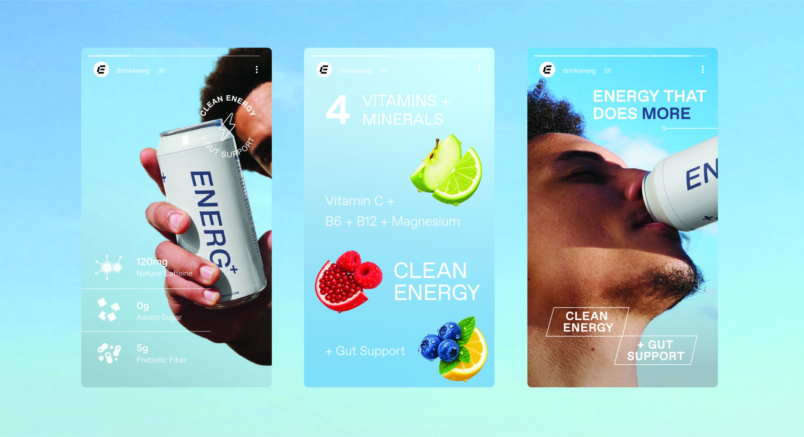
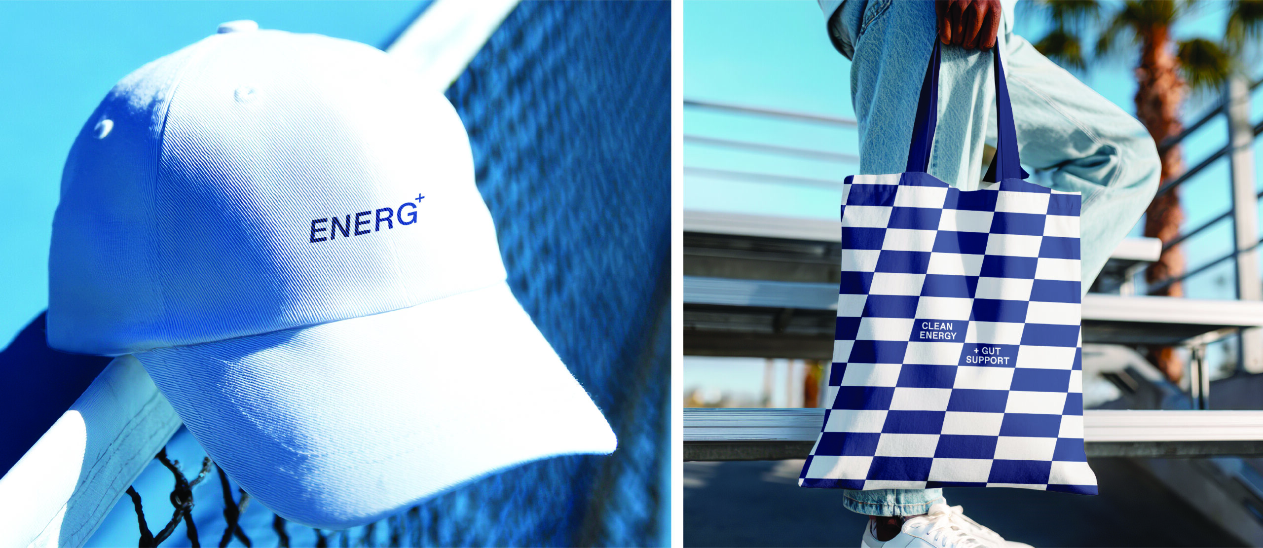
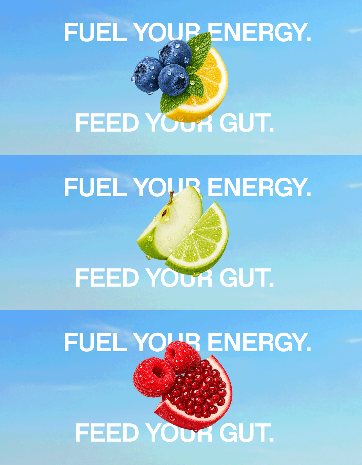
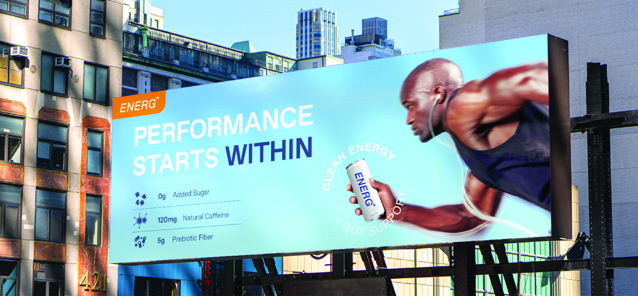
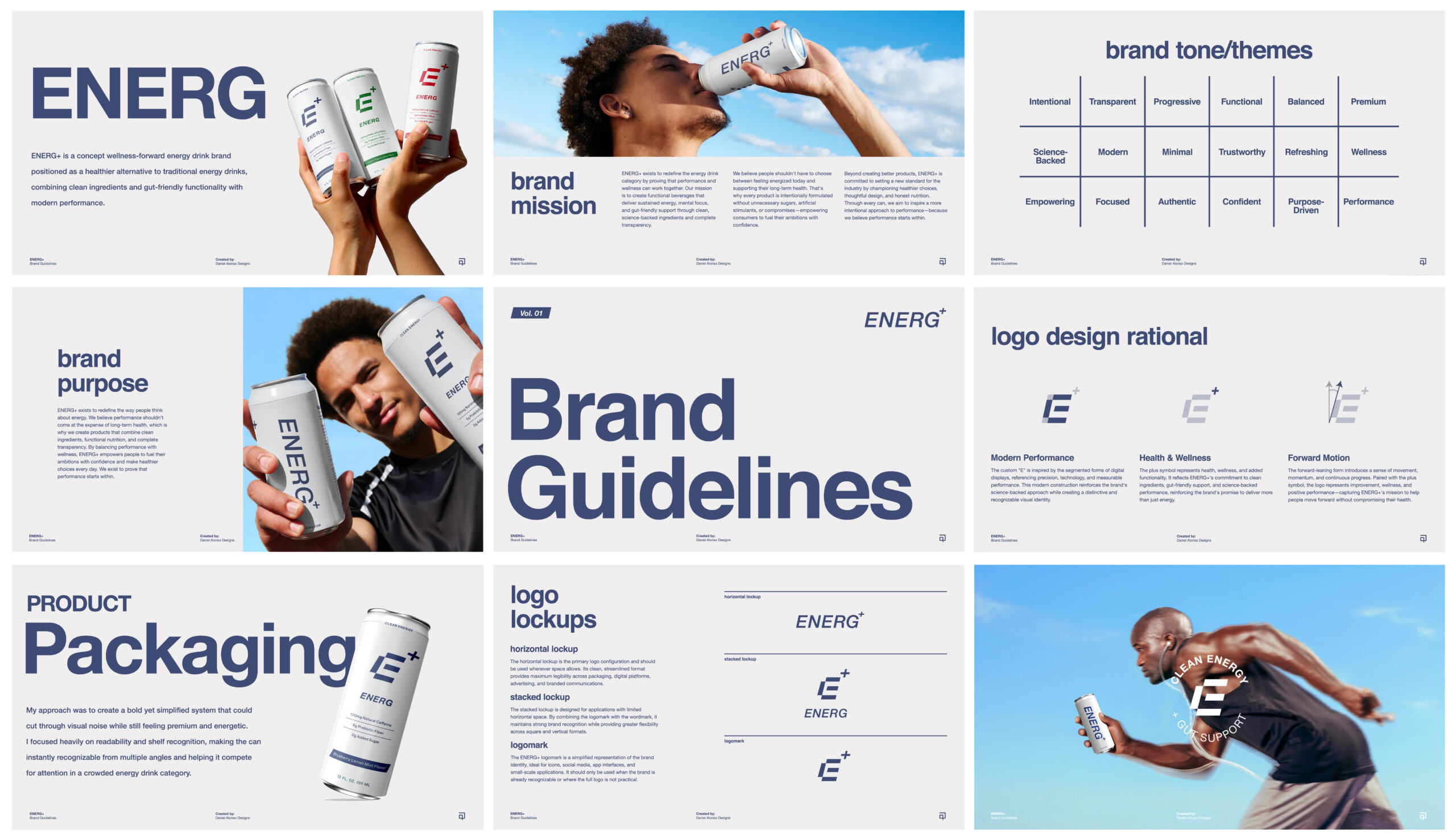
ENERG+ is a concept wellness-forward energy drink brand positioned as a healthier alternative to traditional energy drinks, combining clean ingredients and gut-friendly functionality with modern performance.
SERVICES
Brand Identity
Packaging Design
Website Design
Digital Ads
Brand Guidelines
CHALLENGE
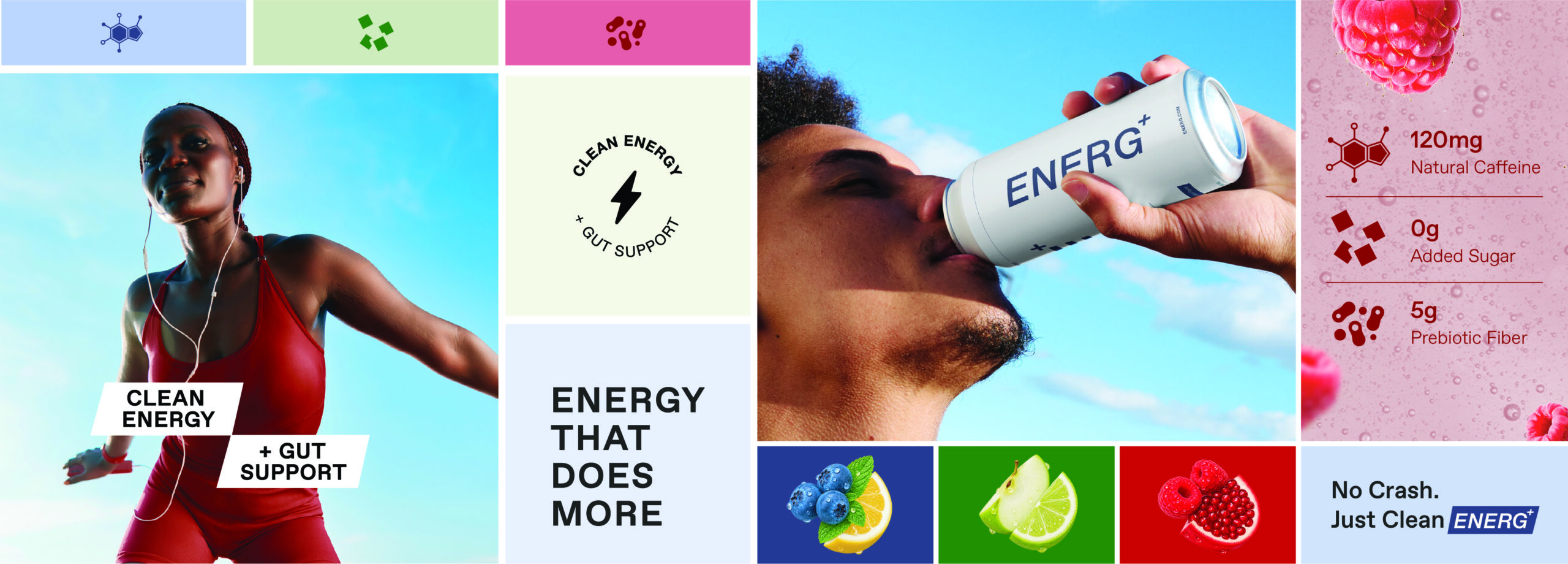
The energy drink industry is saturated with aggressive visuals, overstimulating branding, and formulas loaded with caffeine, sugar, and artificial stimulants. The challenge was to position ENERG+ as a more balanced, wellness-forward alternative that could stand out on shelf while clearly communicating clean ingredients, transparency, and gut-friendly functionality to a growing audience of health-conscious young adults who are increasingly intentional about what they put into their bodies.
brand
strategy
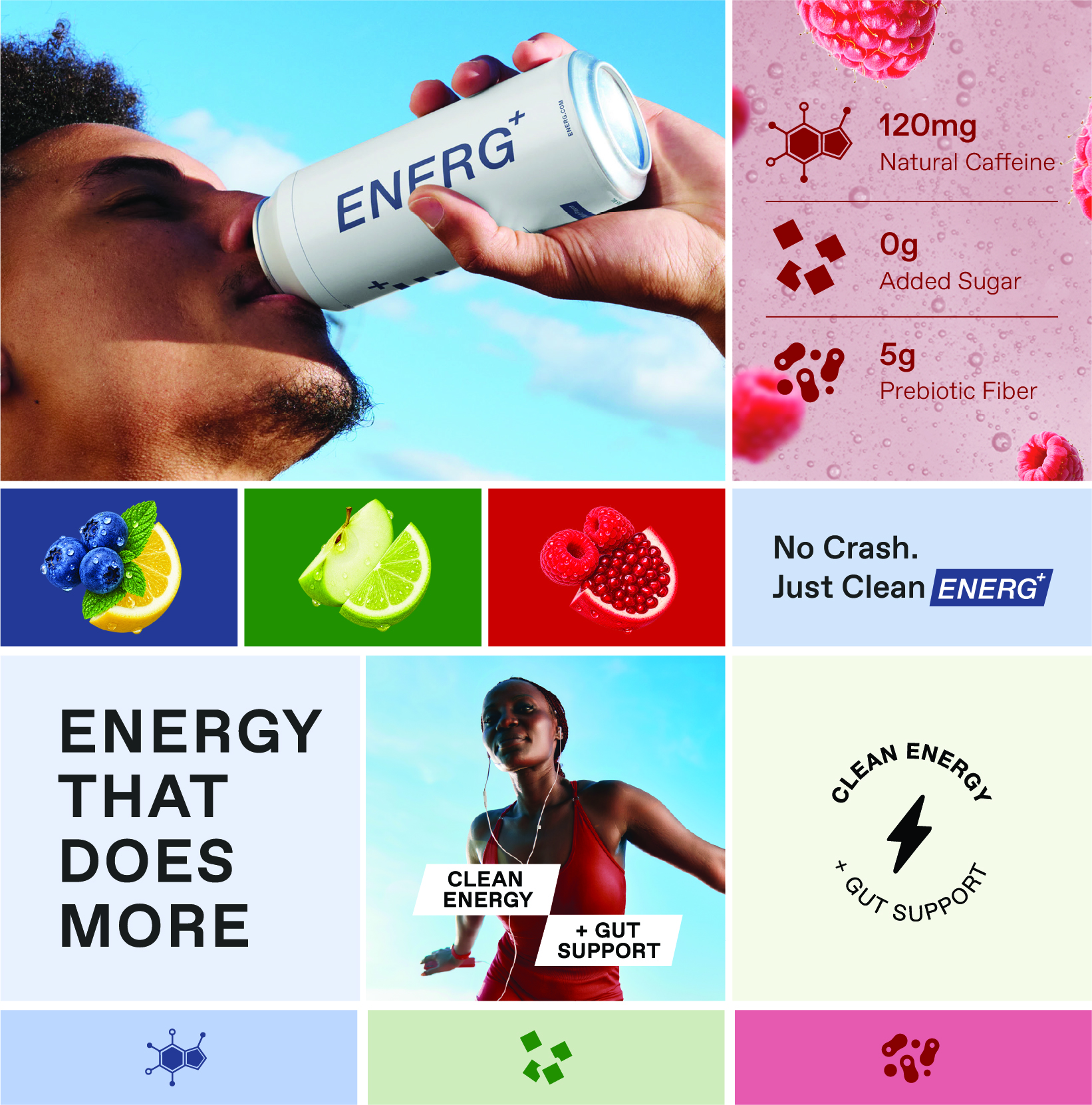
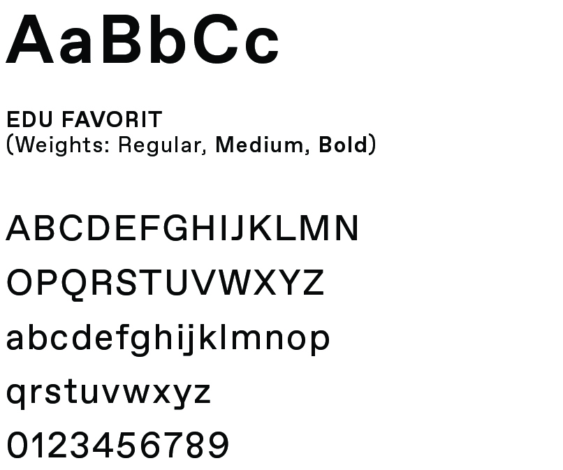
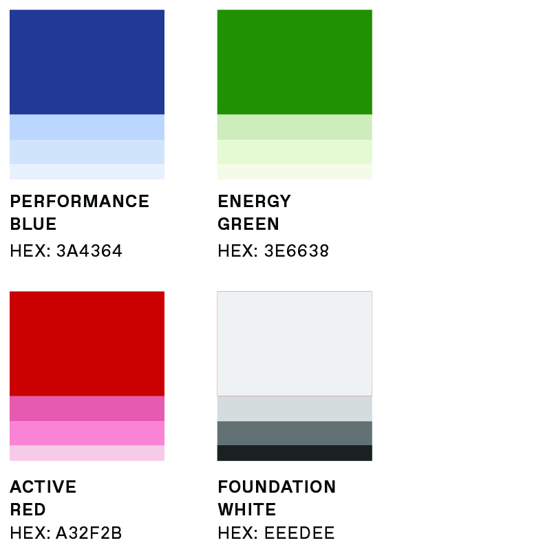
To appeal to a health-conscious audience, I developed a visual identity that feels modern, science-backed, and approachable through bold yet controlled typography, generous negative space, and a cohesive color system that differentiates flavors while maintaining a unified brand experience. The result is a brand that challenges the conventions of traditional energy drinks by offering a cleaner, more transparent, and wellness-focused approach to energy.
01
AUDIENCE
Health-conscious young adults looking for sustained energy without the excessive caffeine, sugar, and artificial feel often associated with traditional energy drinks.
02
POSITIONING
A wellness-forward energy drink that combines clean energy, gut-friendly functionality, and modern performance for people who want more from what they drink.
03
CREATIVE DIRECTION
Modern, fresh, and energetic—balancing the credibility of wellness with the energy and confidence expected from the category.
04
BRAND PILLARS
Clean Ingredients
Gut-Friendly Functionality
Modern Performance
Transparency
visual
identity
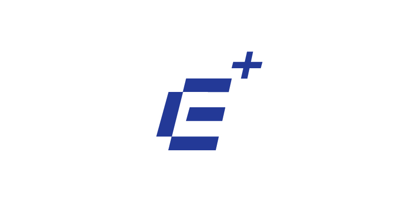
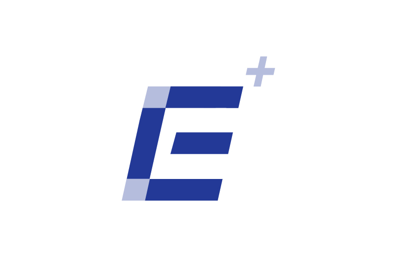
The ENERG+ identity brings together performance and wellness through a clean, modern visual system. A bold E+ mark, minimal typography, and a flexible color palette create a distinctive identity designed to feel energetic, functional, and approachable.
TYPOGRAPHY
COLOR SYSTEM
WORDMARK
PRIMARY LOGO
LOGO MARK
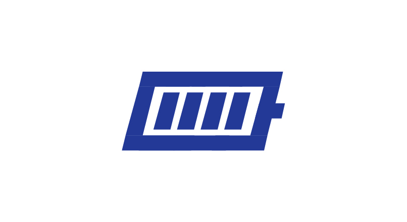
BATTERY-INSPIRED ENERGY ICON
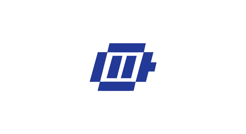
INFLUENCED BY DIGITAL DISPLAY GEOMETRY
LOGO DESIGN RATIONAL
modern performance
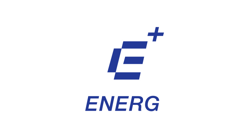
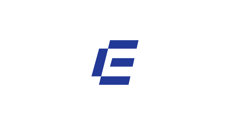
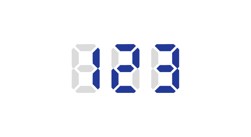
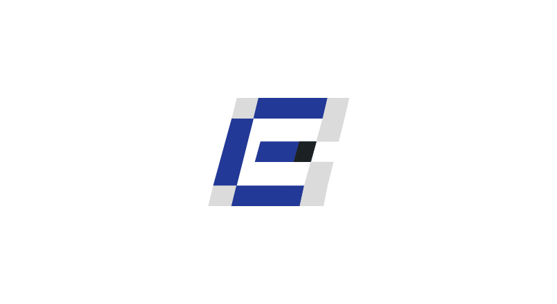
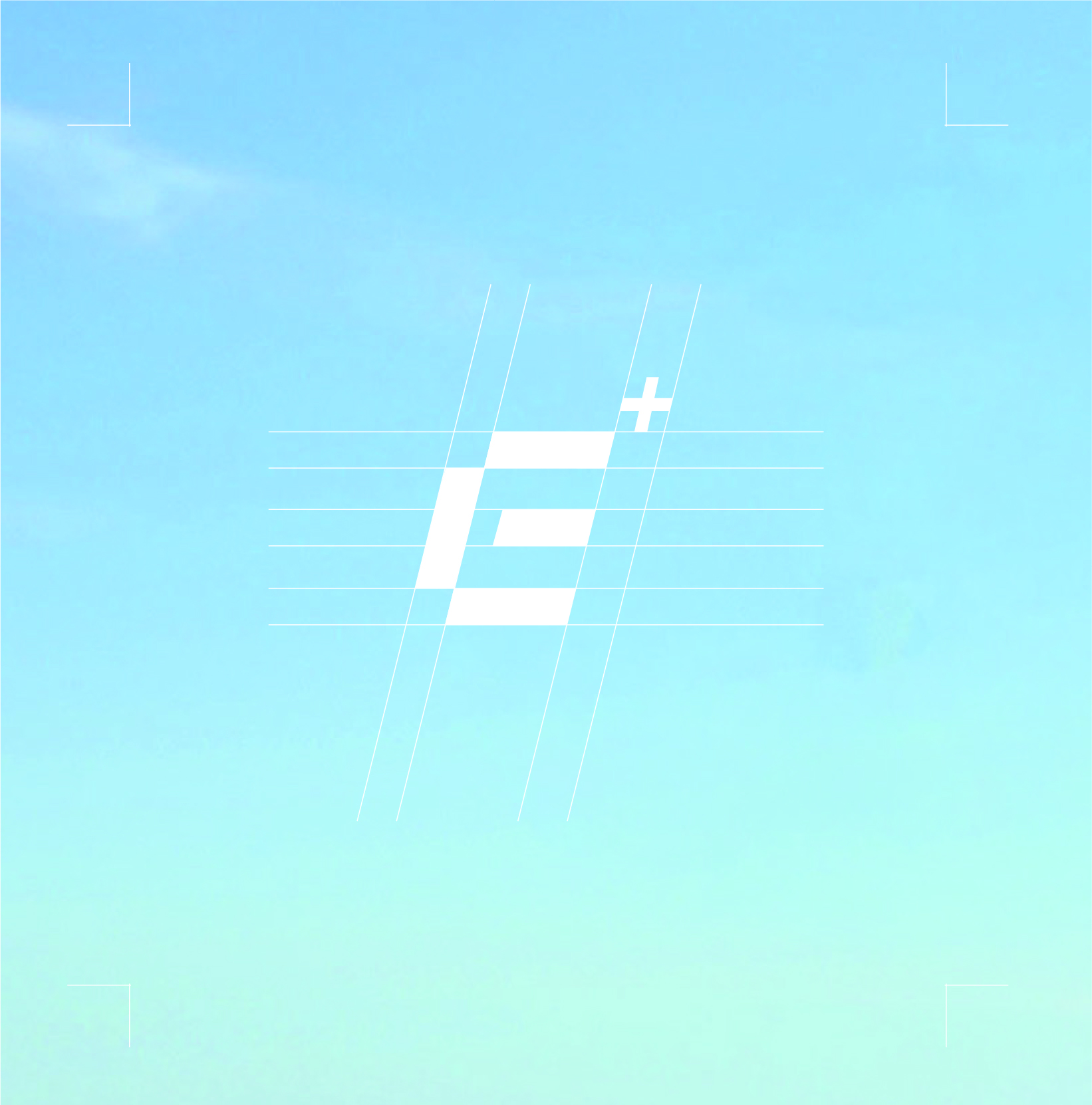
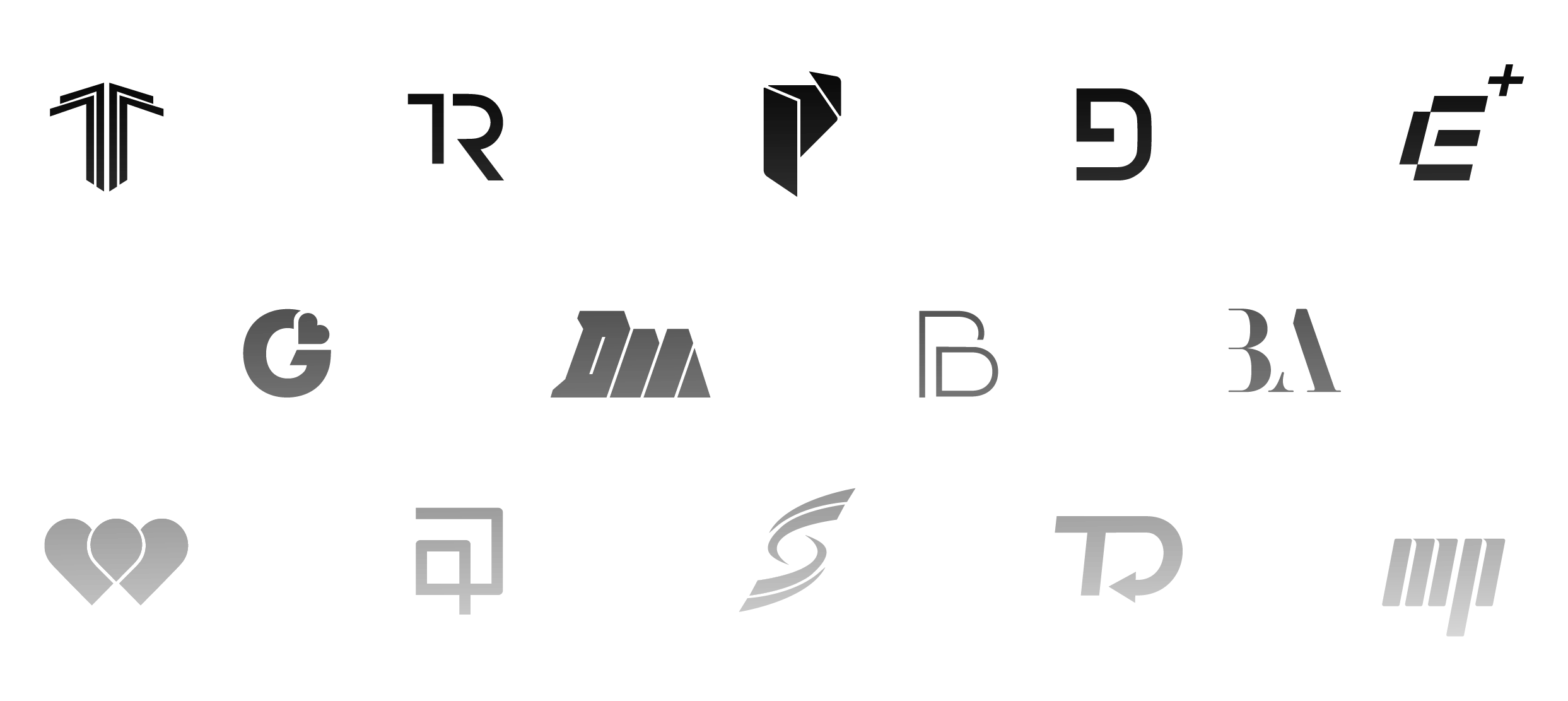
The custom “E” is inspired by the segmented forms of digital displays, referencing precision, technology, and measurable performance. This modern construction reinforces the brand’s science-backed approach while creating a distinctive and recognizable visual identity.
health & wellness
The plus symbol represents health, wellness, and added functionality. It reflects ENERG+’s commitment to clean ingredients, gut-friendly support, and science-backed performance, reinforcing the brand’s promise to deliver more than just energy.
forward motion
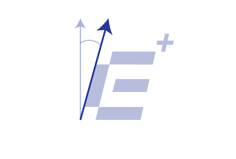
The forward-leaning form introduces a sense of movement, momentum, and continuous progress. Paired with the plus symbol, the logo represents improvement, wellness, and positive performance, capturing ENERG+’s mission to help people move forward without compromising their health.
packaging
design
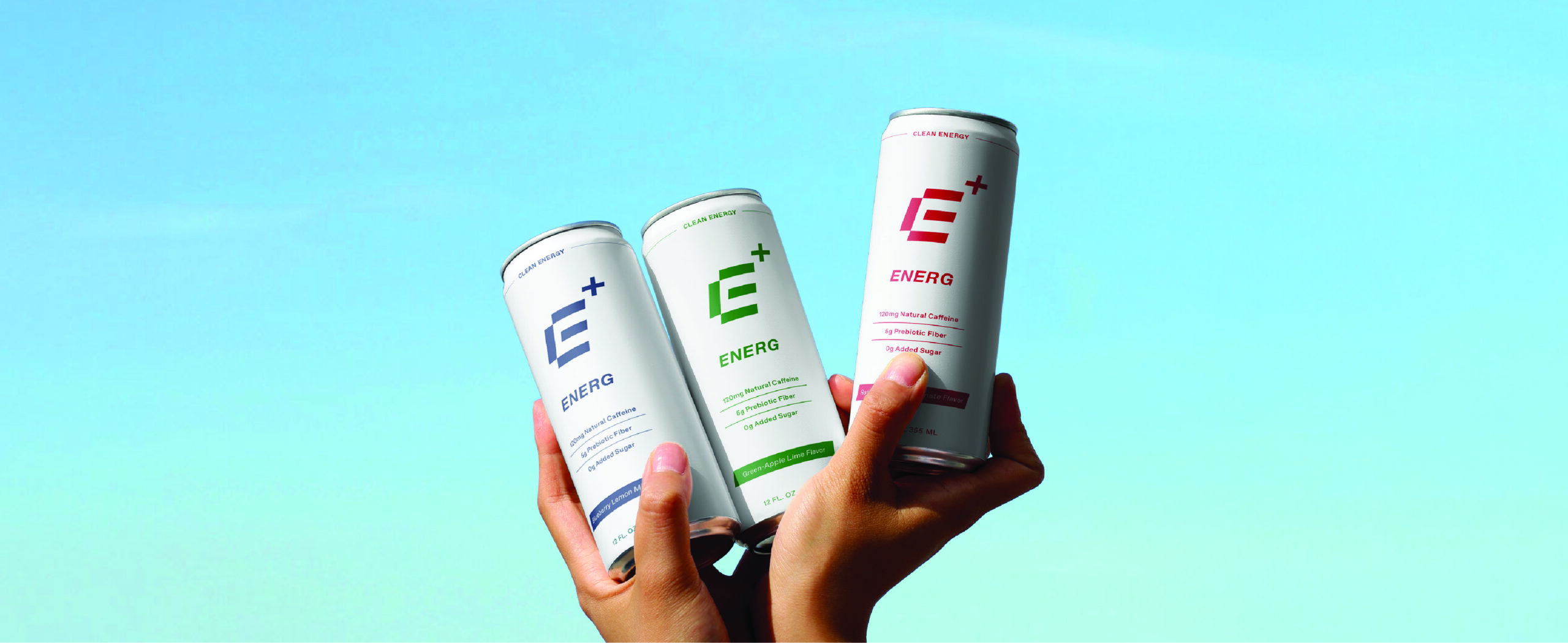
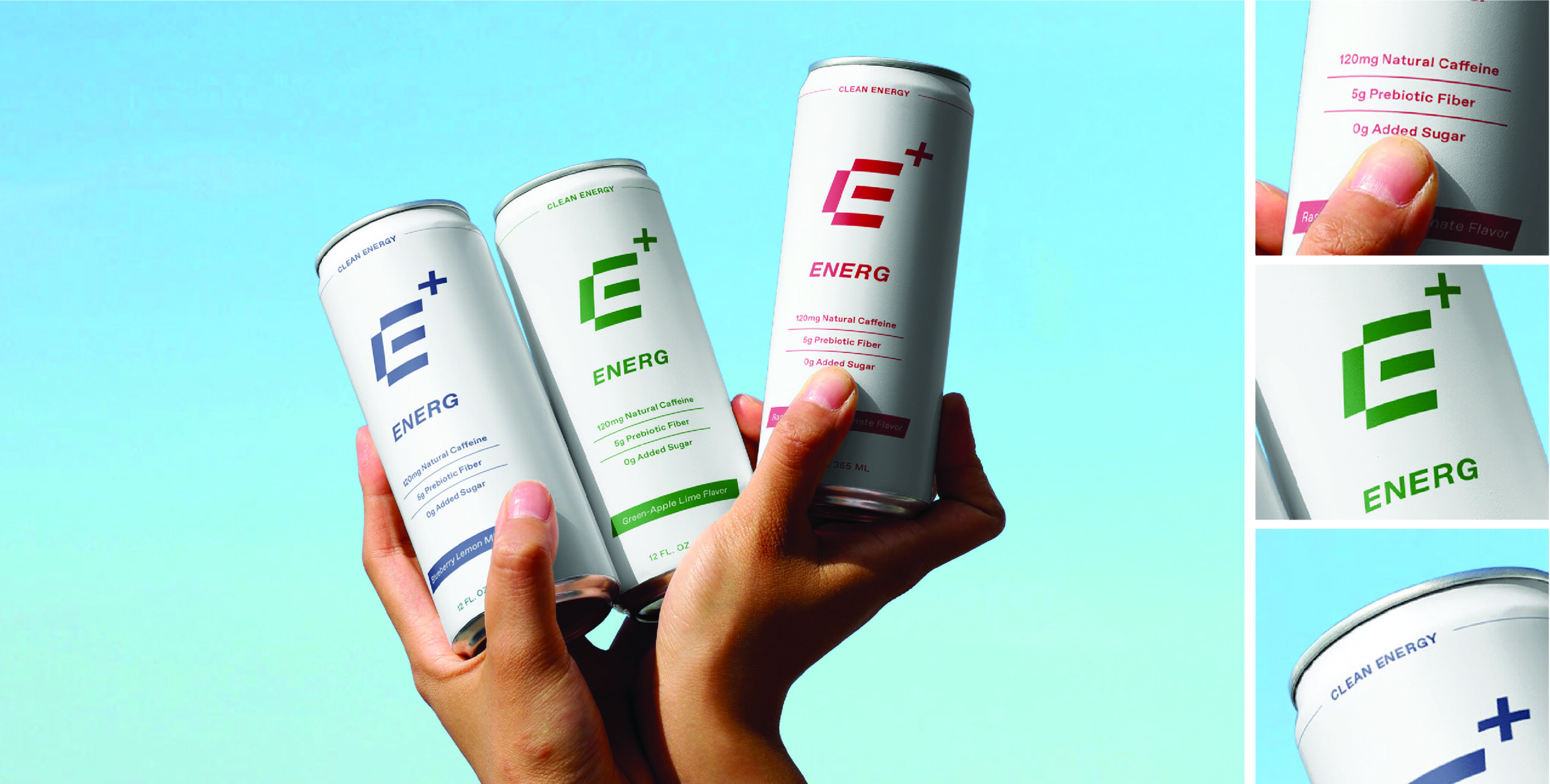
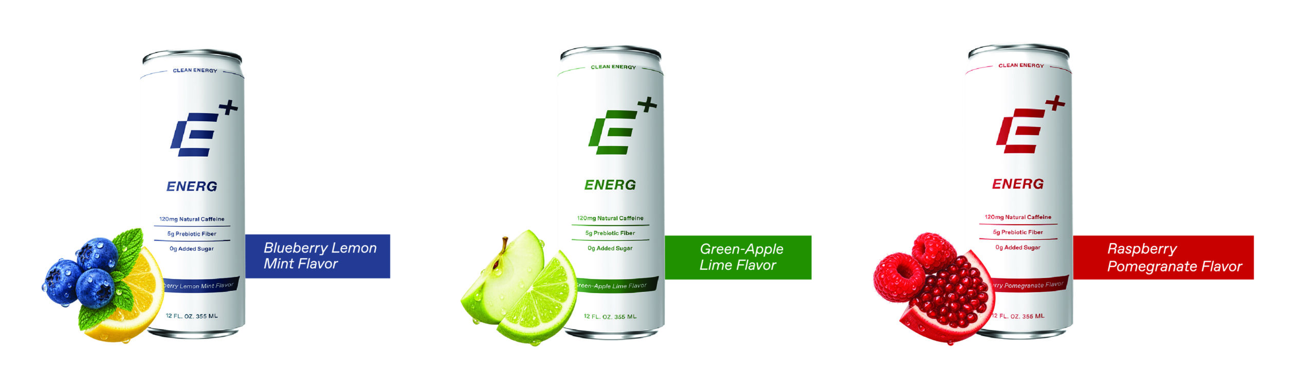
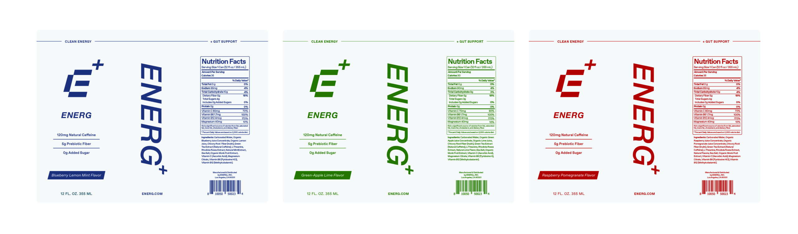
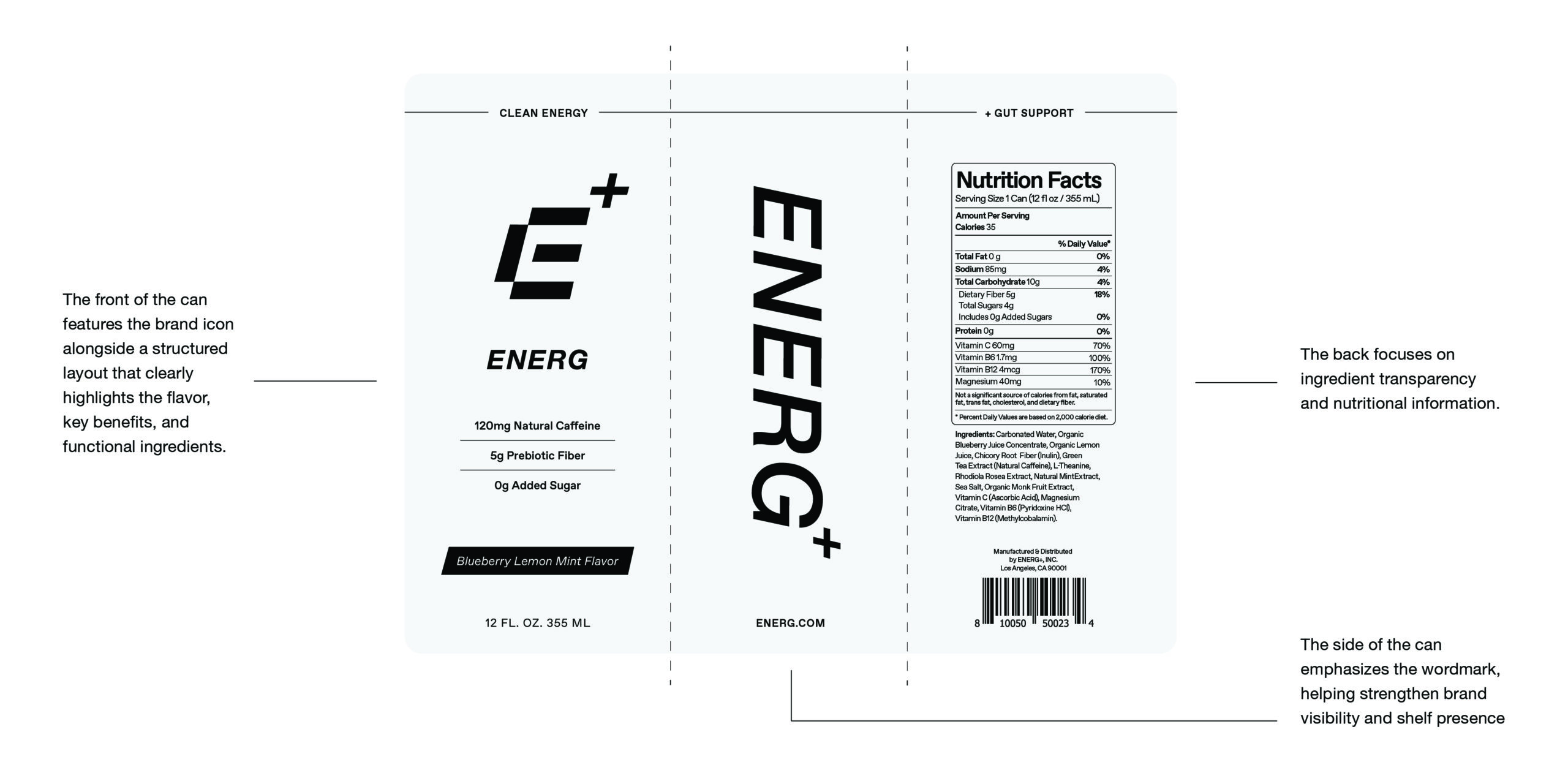
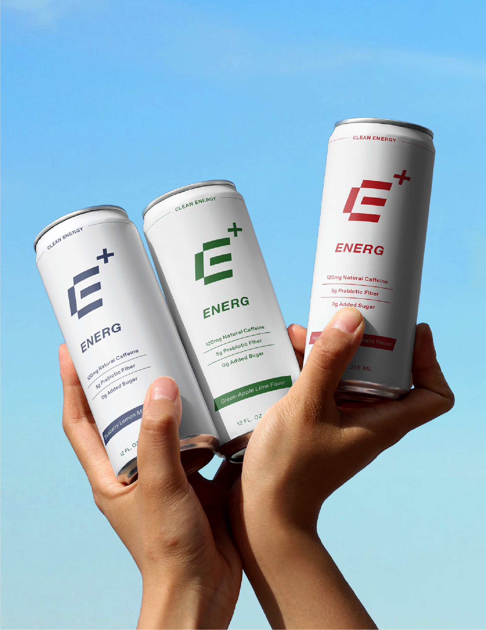
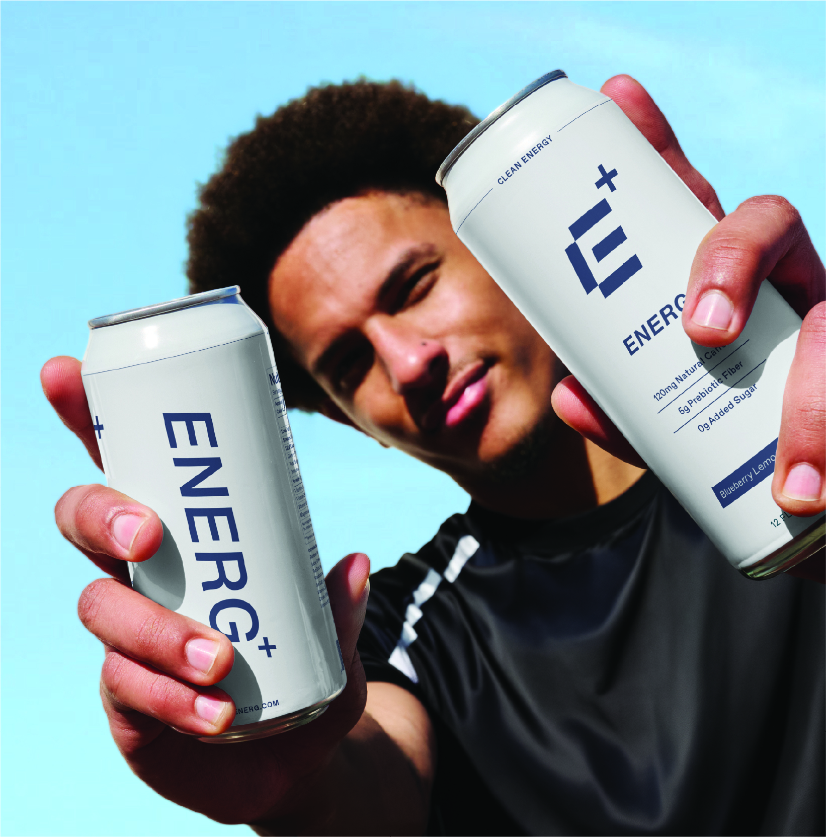
The ENERG+ packaging was designed as a bold yet simplified system that cuts through the visual noise of the energy drink category while still feeling clean, premium, and energetic. A white-forward design, clear hierarchy, and prominent brand elements improve readability and shelf recognition, while functional benefits and ingredients are communicated clearly to reinforce the brand’s wellness-focused positioning.
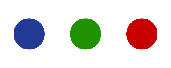
Each flavor is differentiated through its own color while maintaining a consistent structure across the lineup, creating a cohesive product family that feels fresh, recognizable, and distinctly ENERG+.
ENERG+ is a concept wellness-forward energy drink brand positioned as a healthier alternative to traditional energy drinks, combining clean ingredients and gut-friendly functionality with modern performance.
SERVICES
Brand Identity
Packaging Design
Website Design
Digital Ads
Brand Guidelines
CHALLENGE
The energy drink industry is saturated with aggressive visuals, overstimulating branding, and formulas loaded with caffeine, sugar, and artificial stimulants. The challenge was to position ENERG+ as a more balanced, wellness-forward alternative that could stand out on shelf while clearly communicating clean ingredients, transparency, and gut-friendly functionality to a growing audience of health-conscious young adults who are increasingly intentional about what they put into their bodies.
brand
strategy
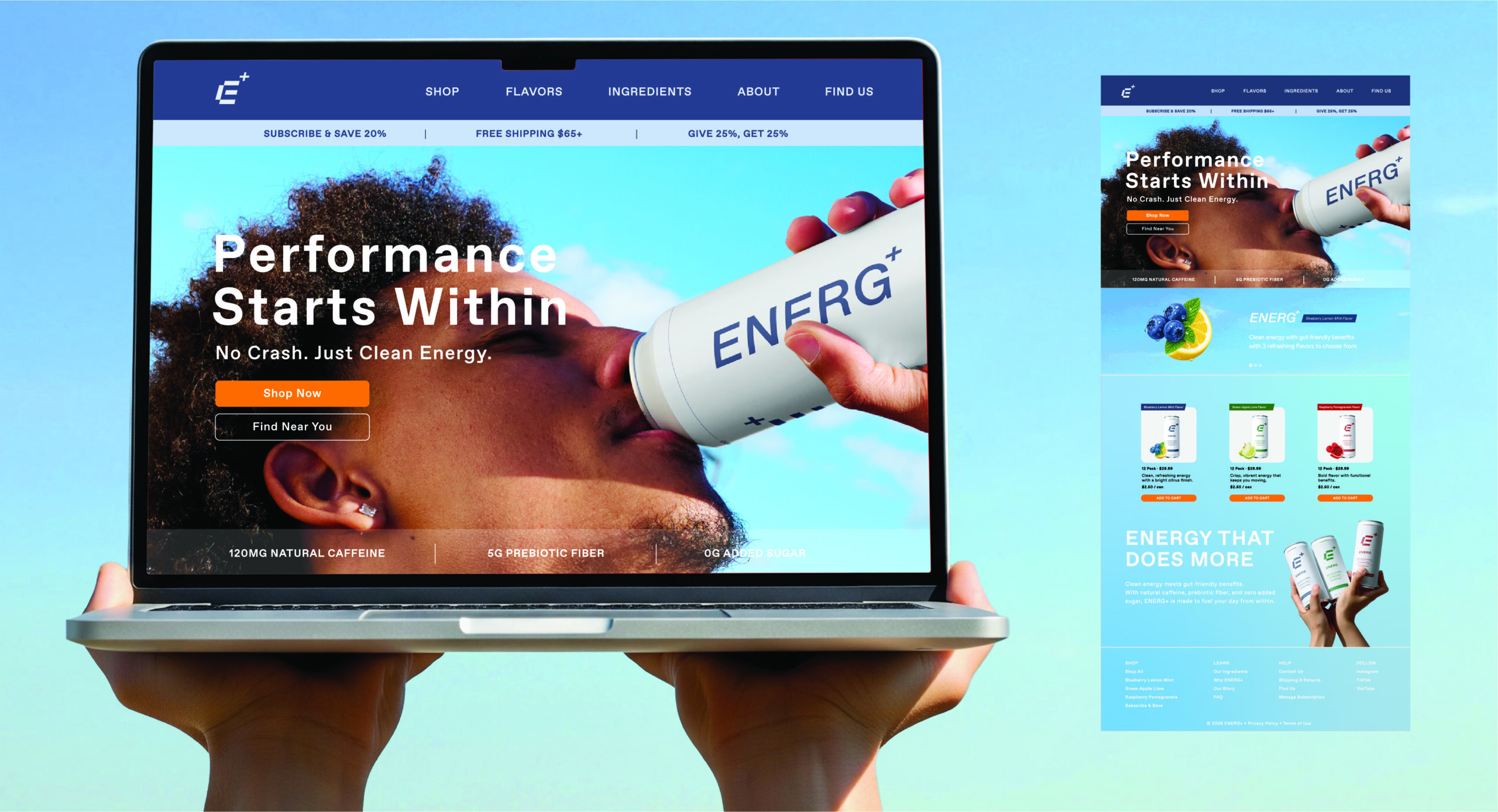
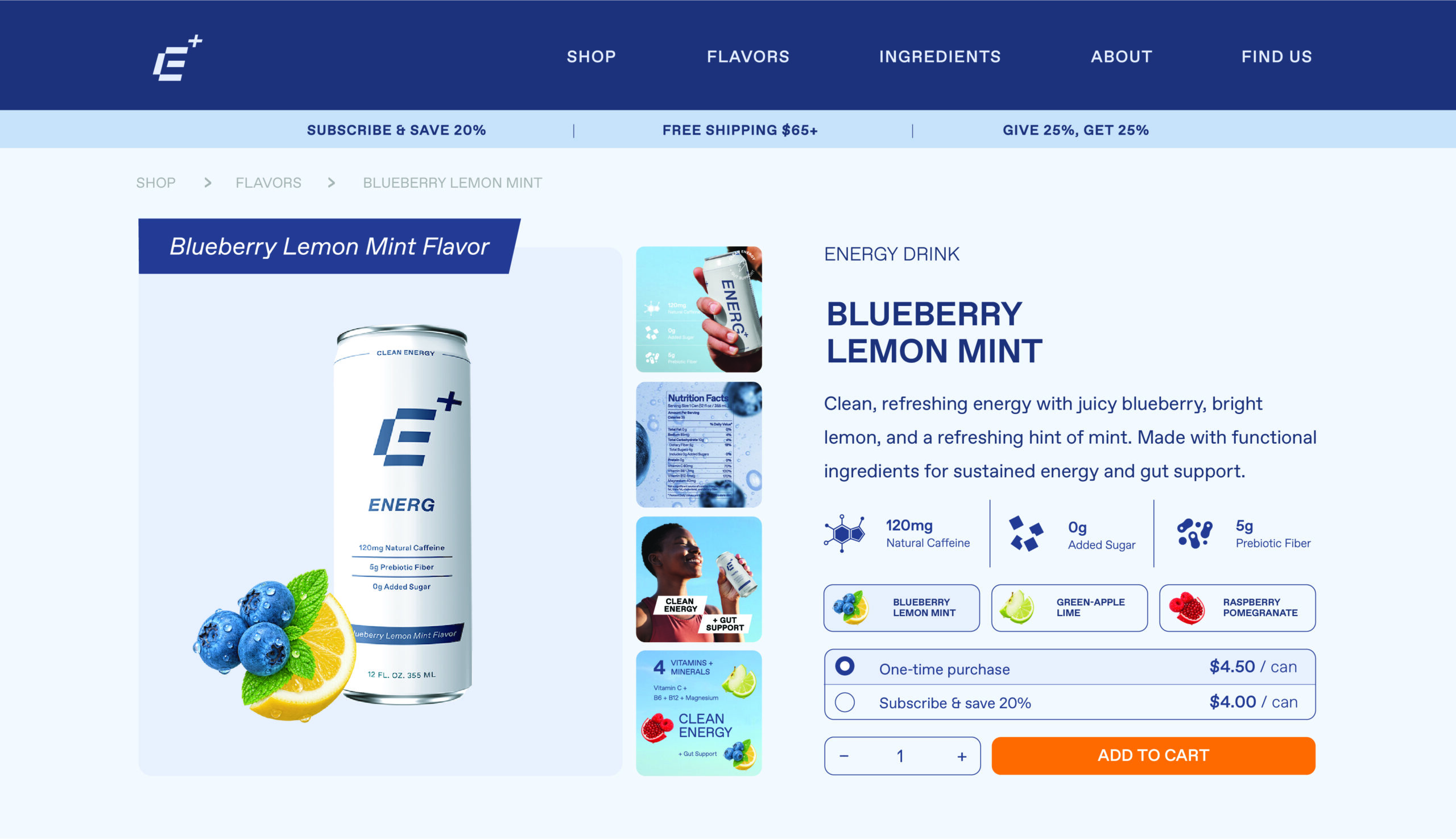
To appeal to a health-conscious audience, I developed a visual identity that feels modern, science-backed, and approachable through bold yet controlled typography, generous negative space, and a cohesive color system that differentiates flavors while maintaining a unified brand experience. The result is a brand that challenges the conventions of traditional energy drinks by offering a cleaner, more transparent, and wellness-focused approach to energy.
01
AUDIENCE
Health-conscious young adults looking for sustained energy without the excessive caffeine, sugar, and artificial feel often associated with traditional energy drinks.
02
POSITIONING
A wellness-forward energy drink that combines clean energy, gut-friendly functionality, and modern performance for people who want more from what they drink.
03
CREATIVE DIRECTION
Modern, fresh, and energetic—balancing the credibility of wellness with the energy and confidence expected from the category.
04
BRAND PILLARS
Clean Ingredients
Gut-Friendly Functionality
Modern Performance
Transparency
visual
identity
The ENERG+ identity brings together performance and wellness through a clean, modern visual system. A bold E+ mark, minimal typography, and a flexible color palette create a distinctive identity designed to feel energetic, functional, and approachable.
TYPOGRAPHY
COLOR SYSTEM
WORDMARK
PRIMARY LOGO
LOGO MARK
LOGO DESIGN RATIONAL
forward motion
The forward-leaning form introduces a sense of movement, momentum, and continuous progress. Paired with the plus symbol, the logo represents improvement, wellness, and positive performance, capturing ENERG+’s mission to help people move forward without compromising their health.
health & wellness
The plus symbol represents health, wellness, and added functionality. It reflects ENERG+’s commitment to clean ingredients, gut-friendly support, and science-backed performance, reinforcing the brand’s promise to deliver more than just energy.
modern performance
The custom “E” is inspired by the segmented forms of digital displays, referencing precision, technology, and measurable performance. This modern construction reinforces the brand’s science-backed approach while creating a distinctive and recognizable visual identity.
packaging
design
The ENERG+ packaging was designed as a bold yet simplified system that cuts through the visual noise of the energy drink category while still feeling clean, premium, and energetic. A white-forward design, clear hierarchy, and prominent brand elements improve readability and shelf recognition, while functional benefits and ingredients are communicated clearly to reinforce the brand’s wellness-focused positioning.
Each flavor is differentiated through its own color while maintaining a consistent structure across the lineup, creating a cohesive product family that feels fresh, recognizable, and distinctly ENERG+.