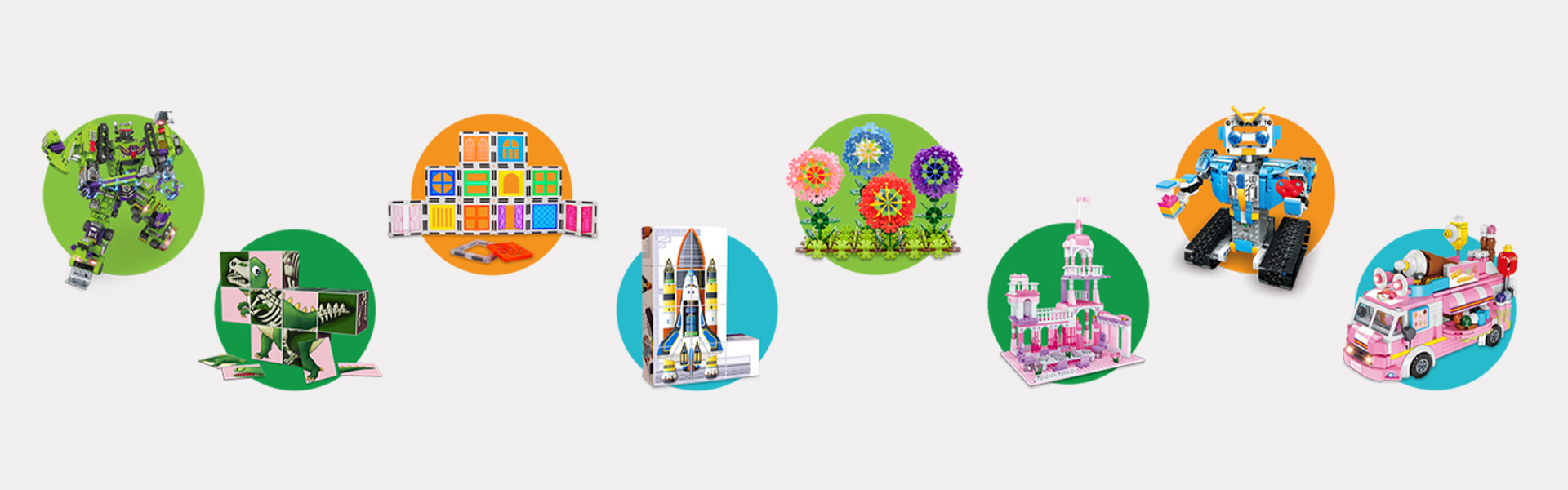
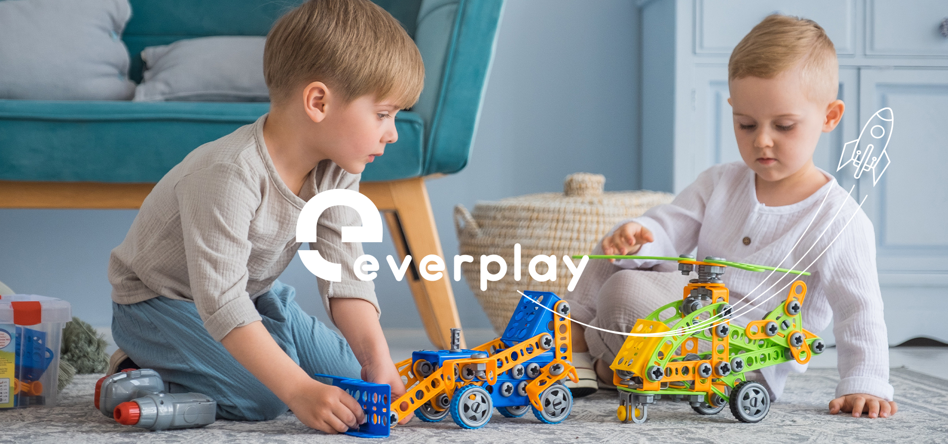
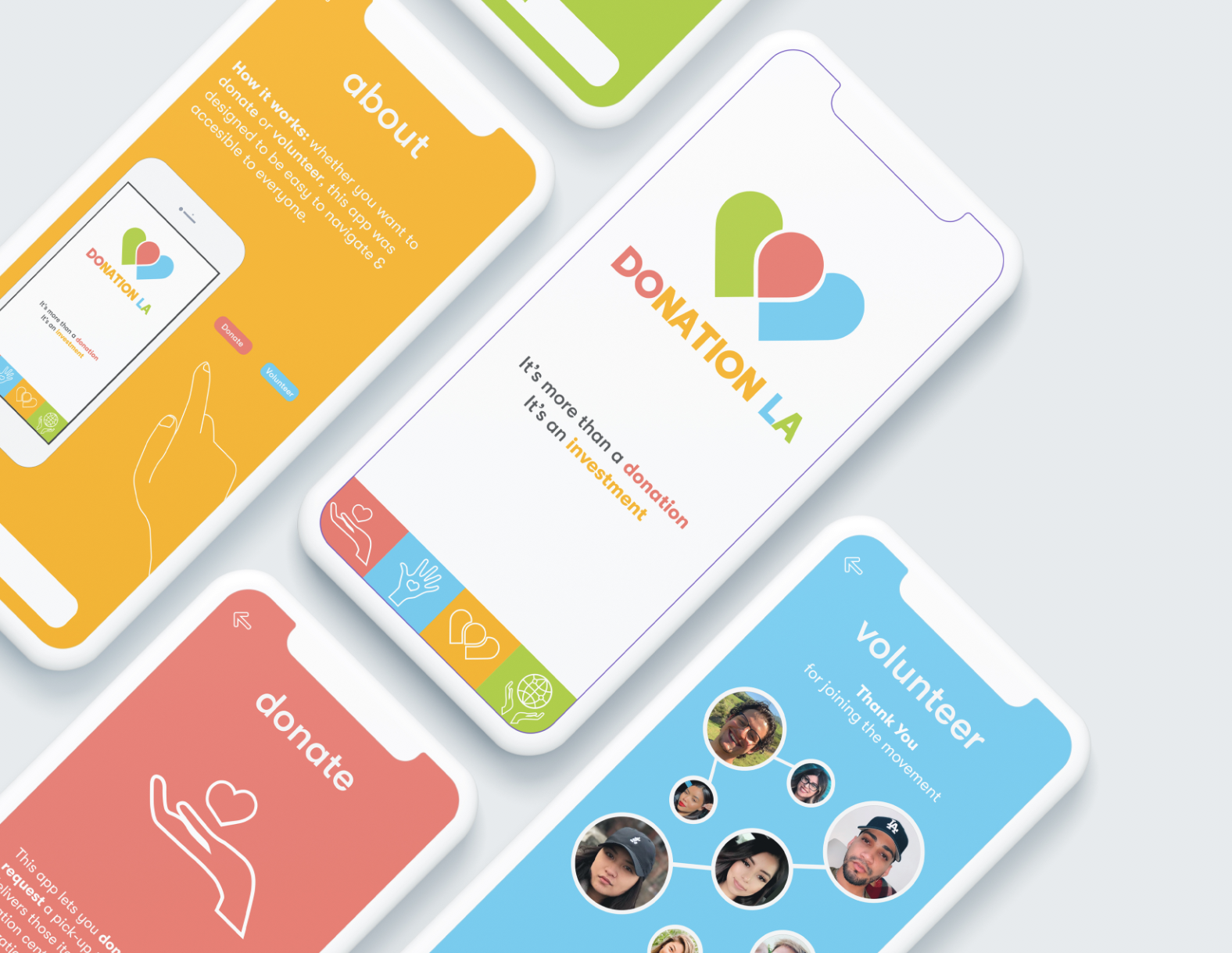
Everplay is a fun active learning toy brand that strives to help creative children in core fundamentals such as the basics of physics, aptitude in mechanics, building and architecture.
The challenge was to rebrand from Picassotiles to Everplay. The creative goal was a modern, minimal, yet playful toy brand that is recognizable and strikes emotion and embodies their passion for creativity and connectivity.
APPROACH
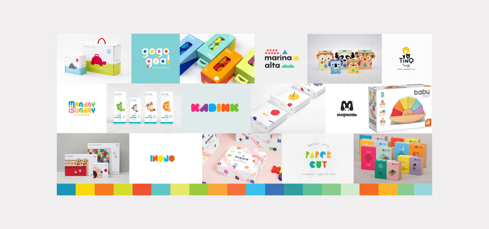
After diving deep in the toy industry. I immersed myself into Picassotiles. I was able to identify the core consumer for their products and began building Everplay’s identity embodying their passion for creative learning and how that connects with their audience.
DELIVERABLES
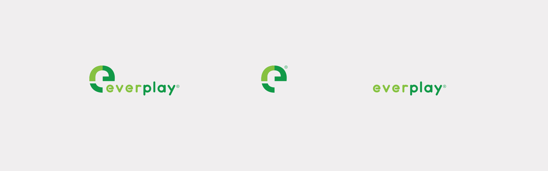
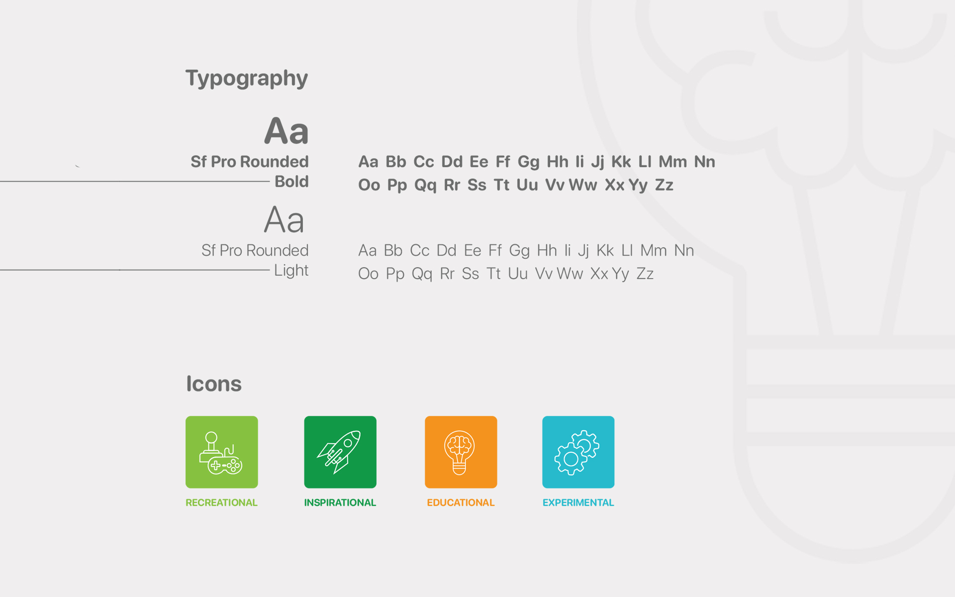
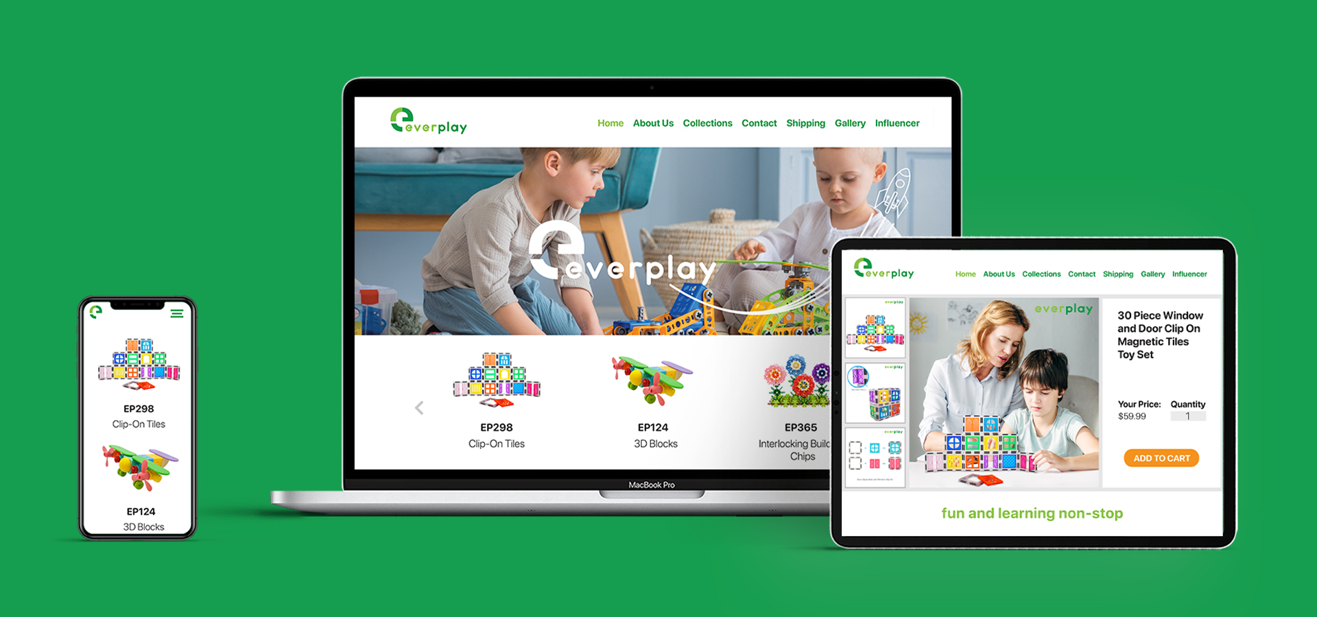
Logo Design
Consumer Research
Brand Ideation
Brand Foundation
Brand Guide
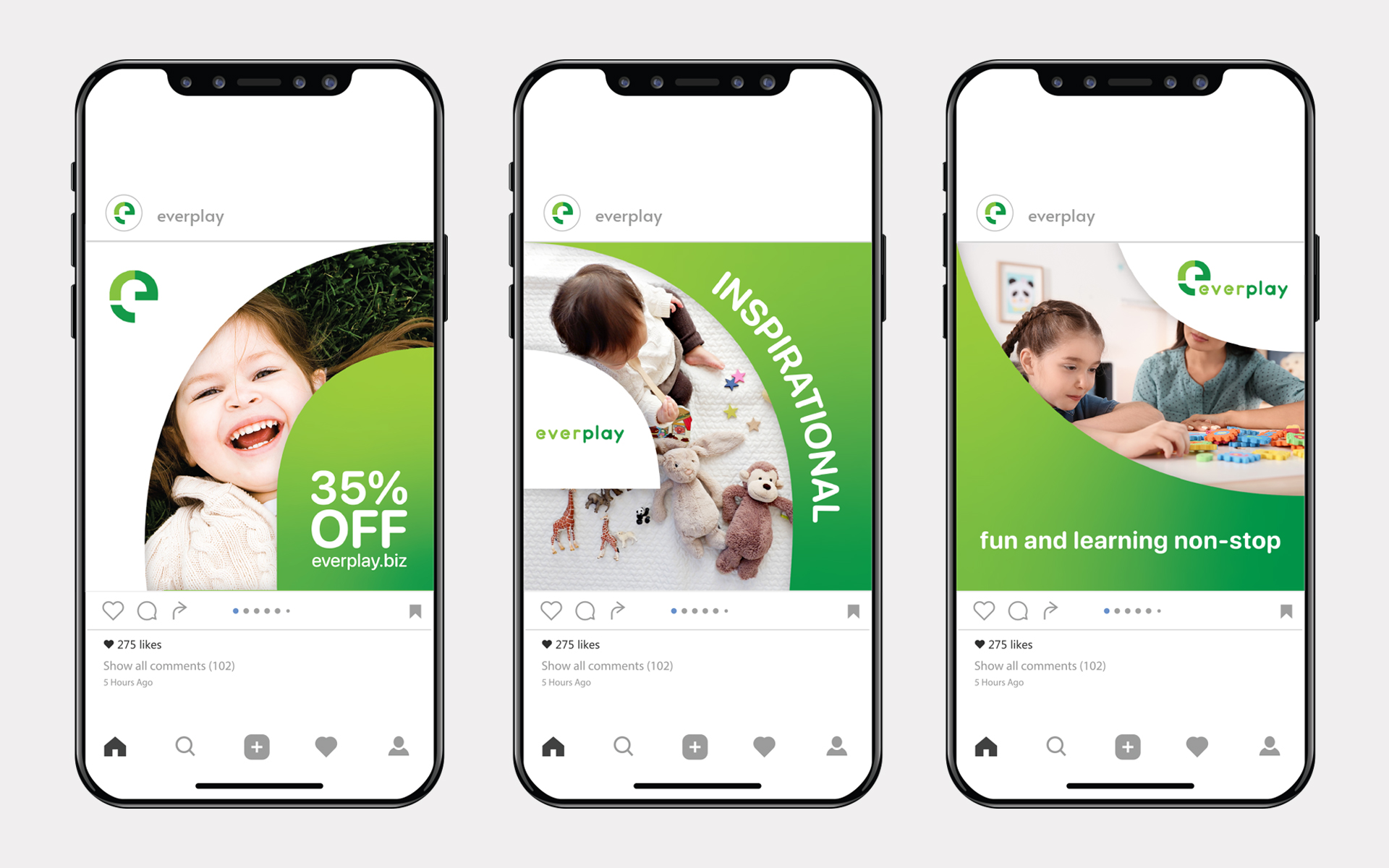
Advertising
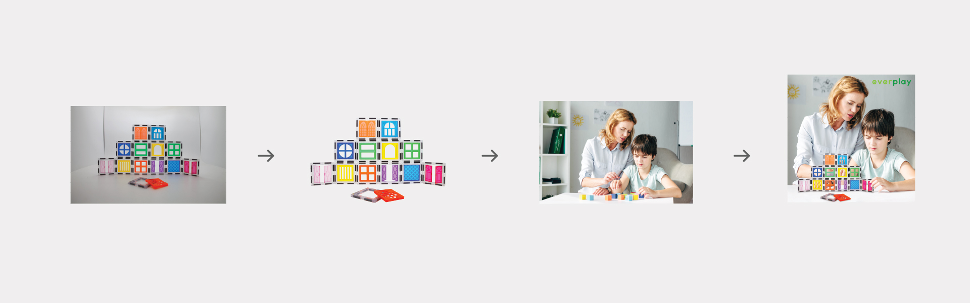
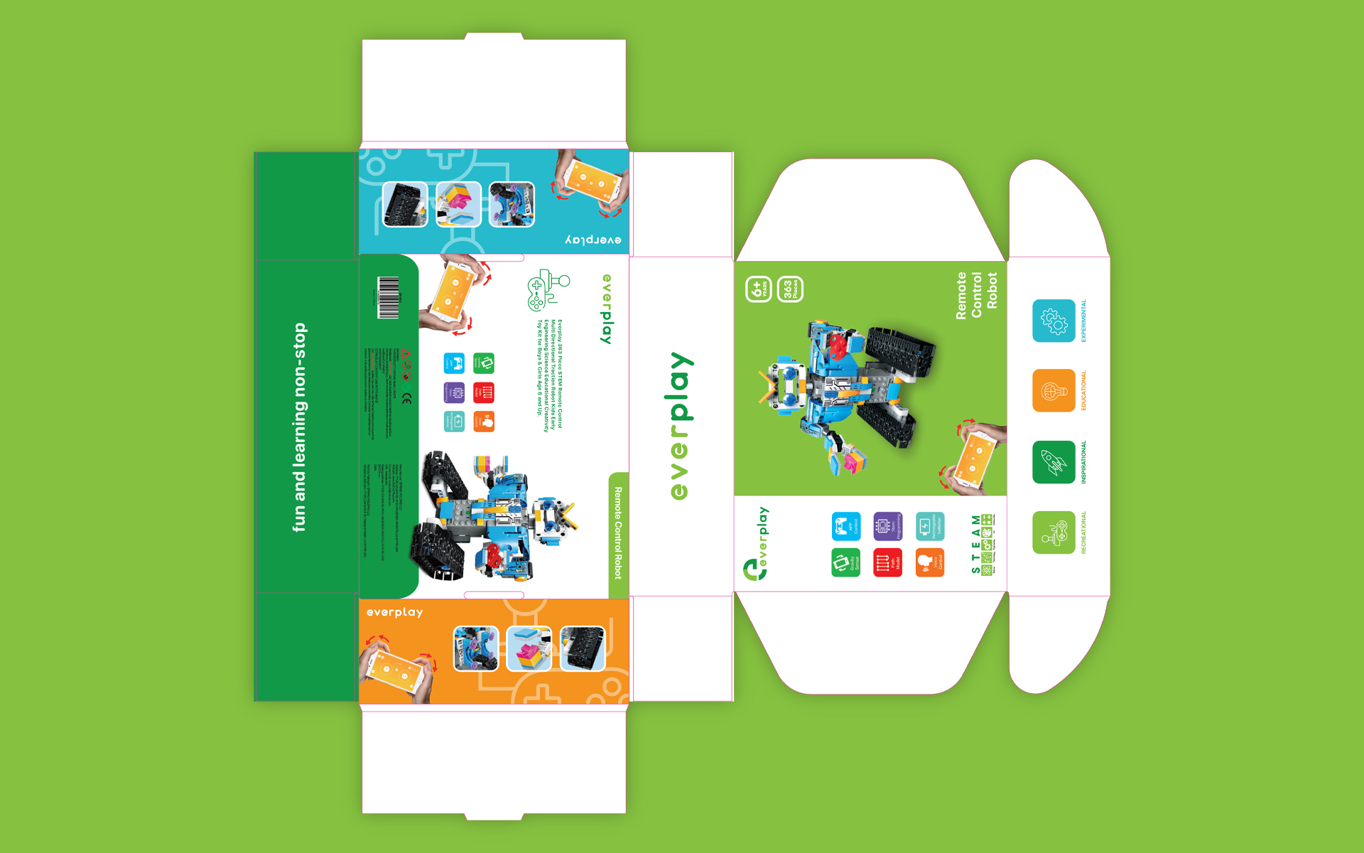
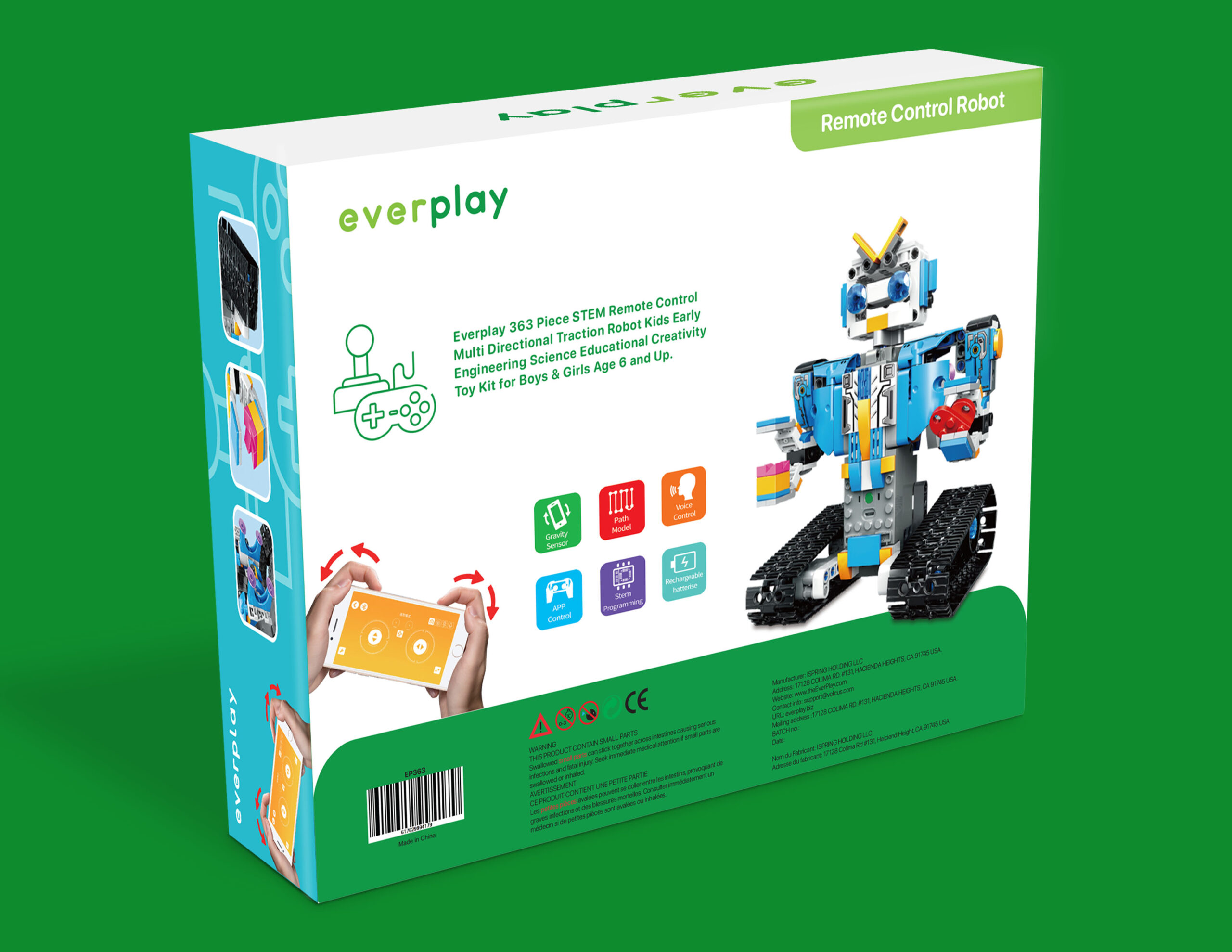
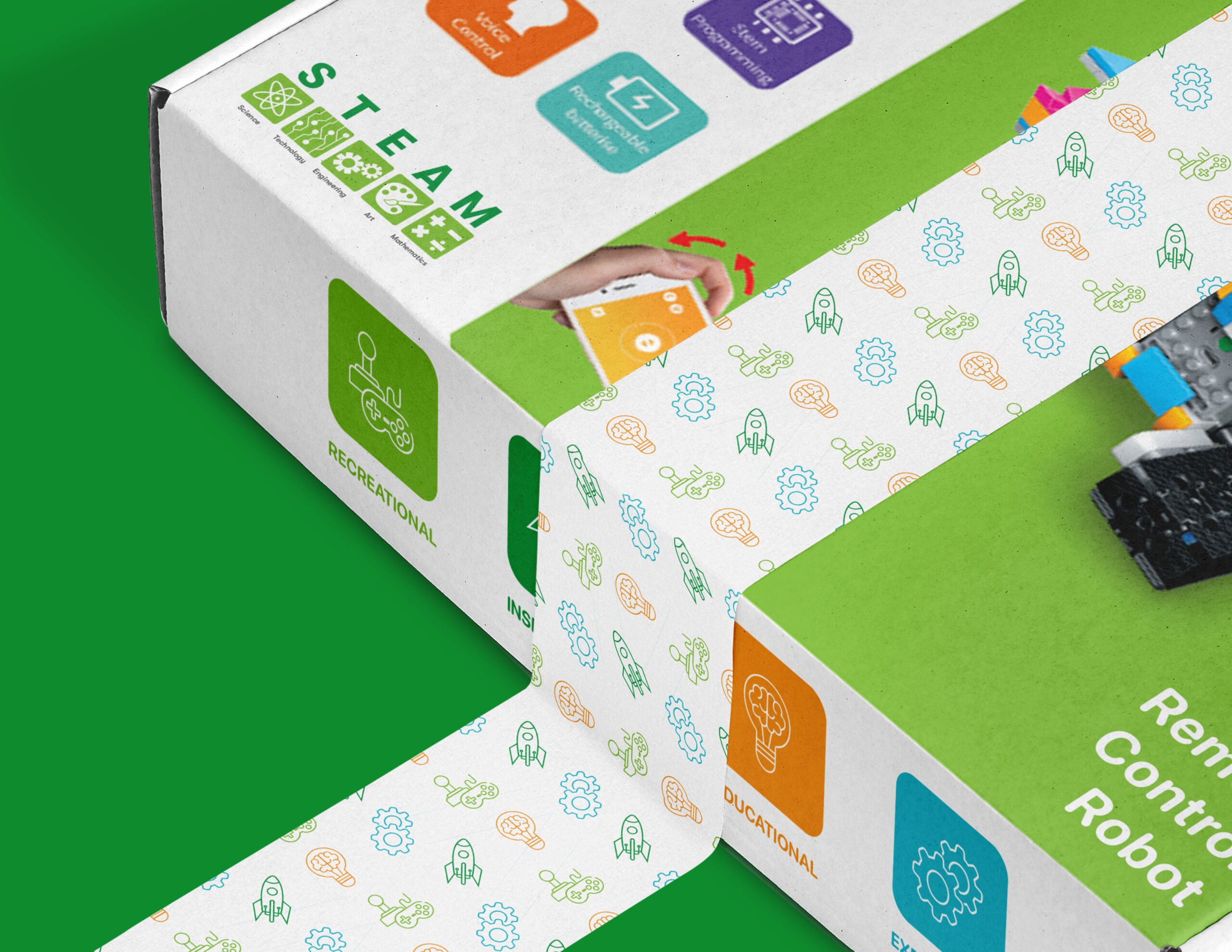
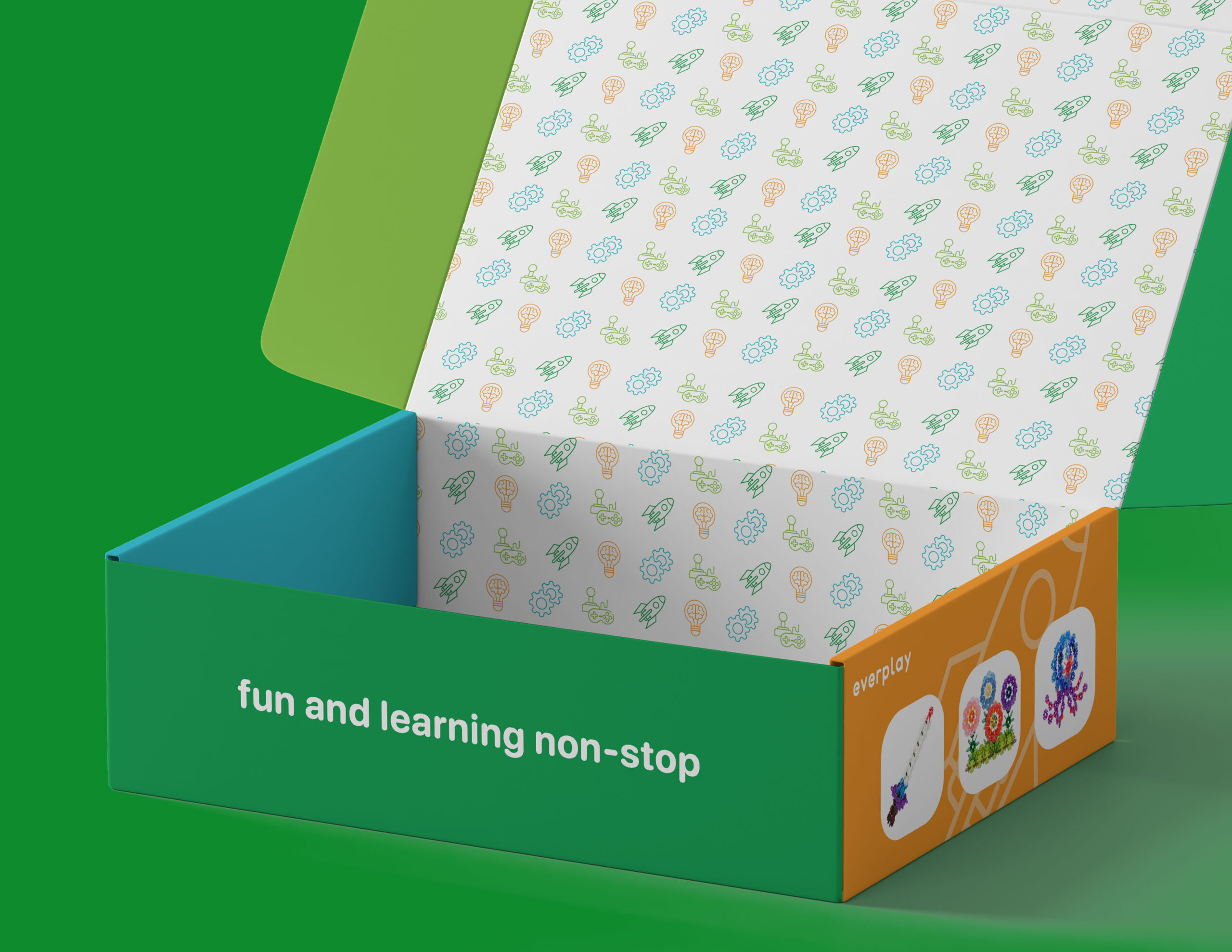
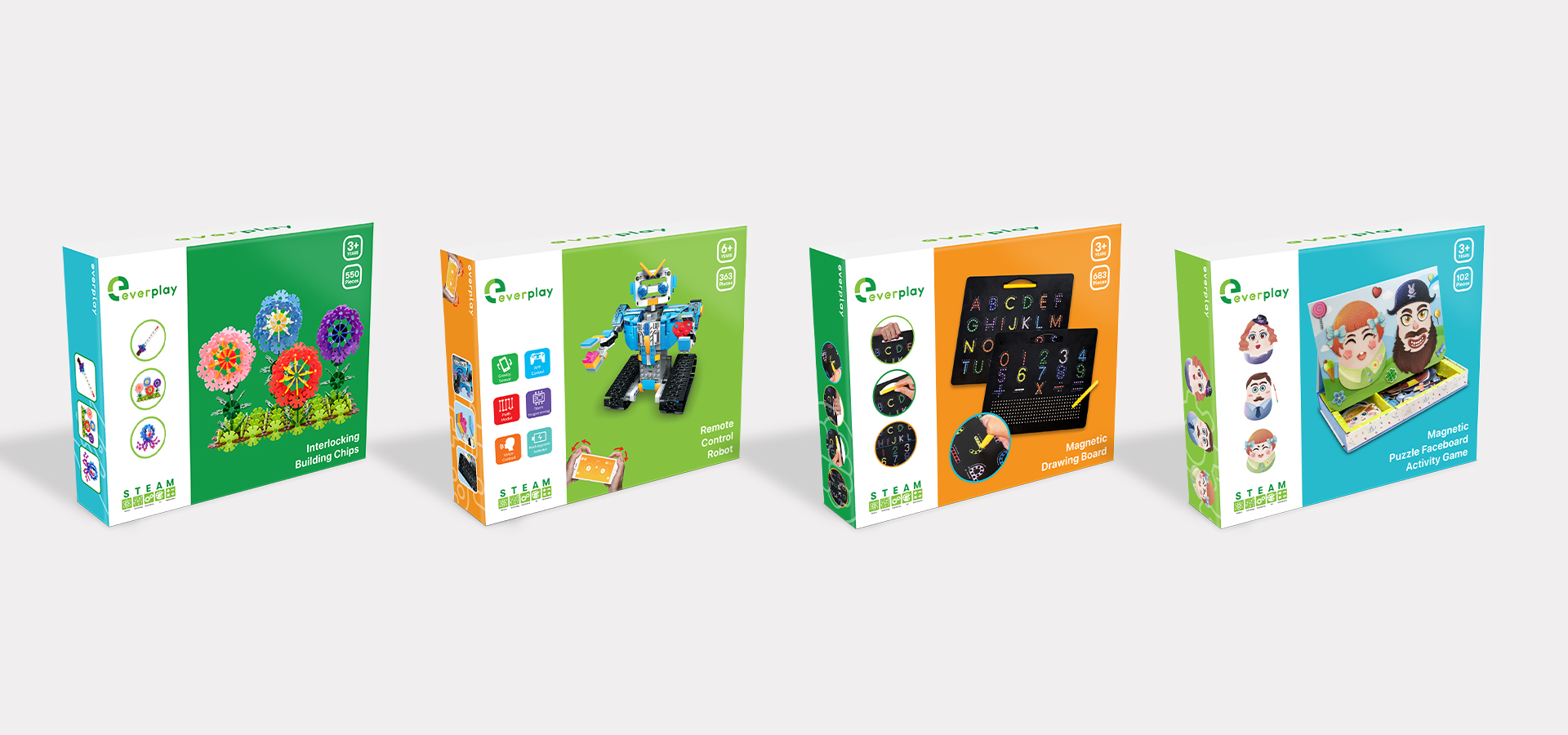
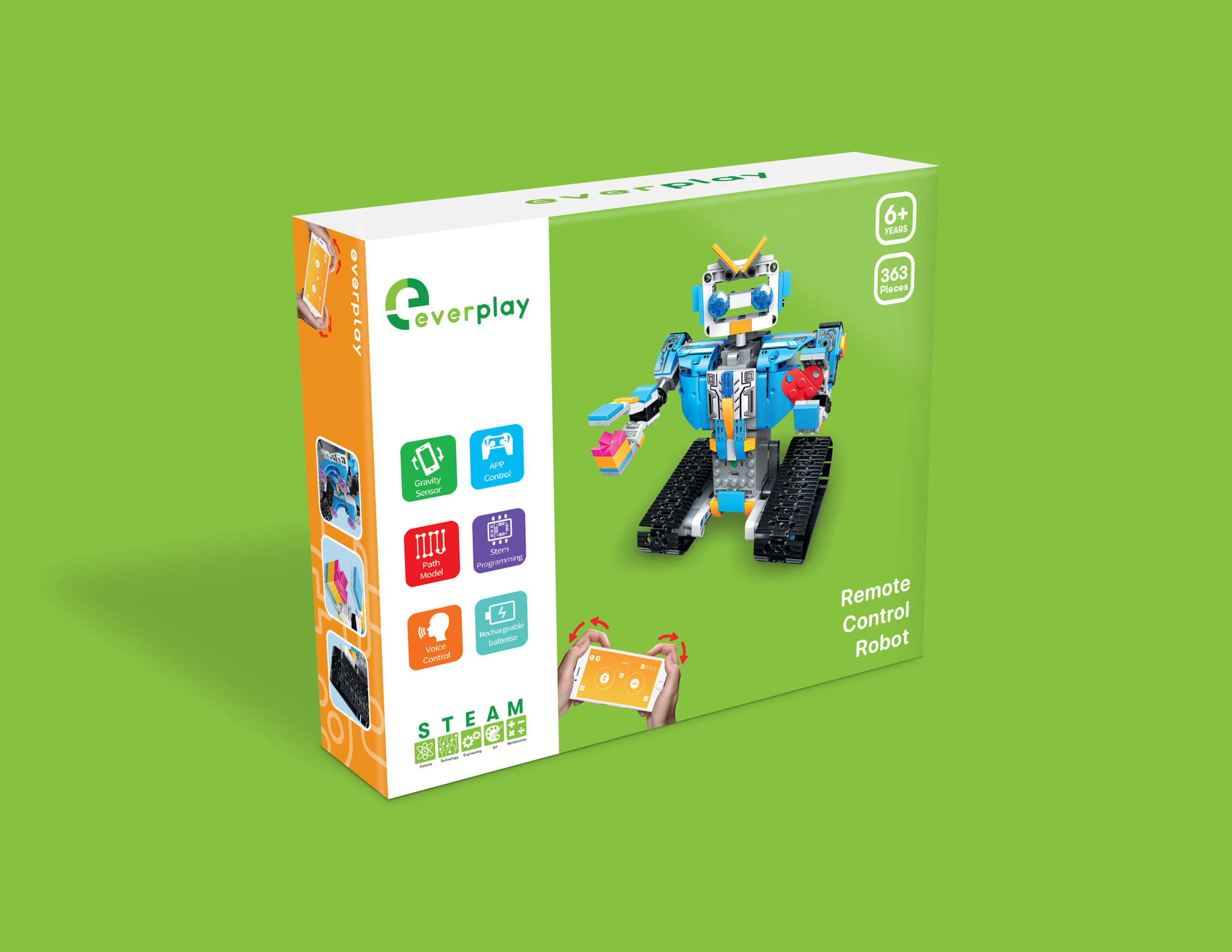
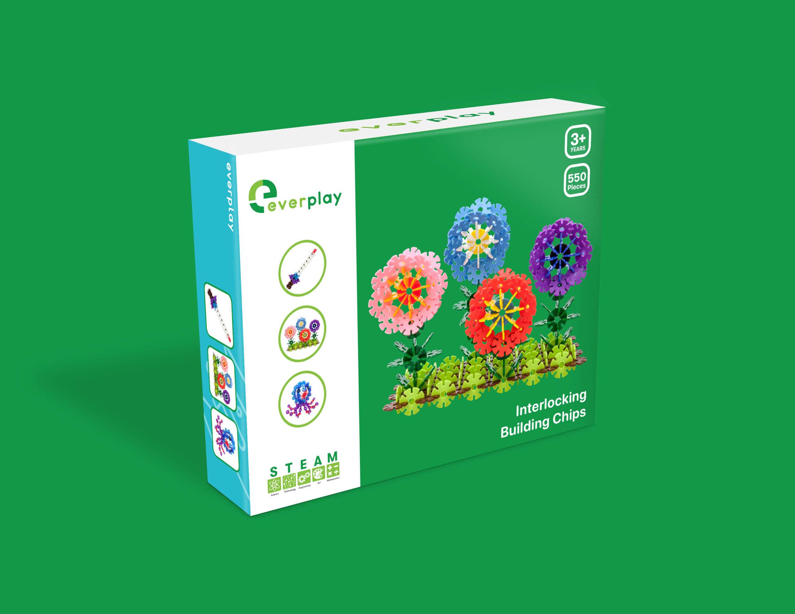
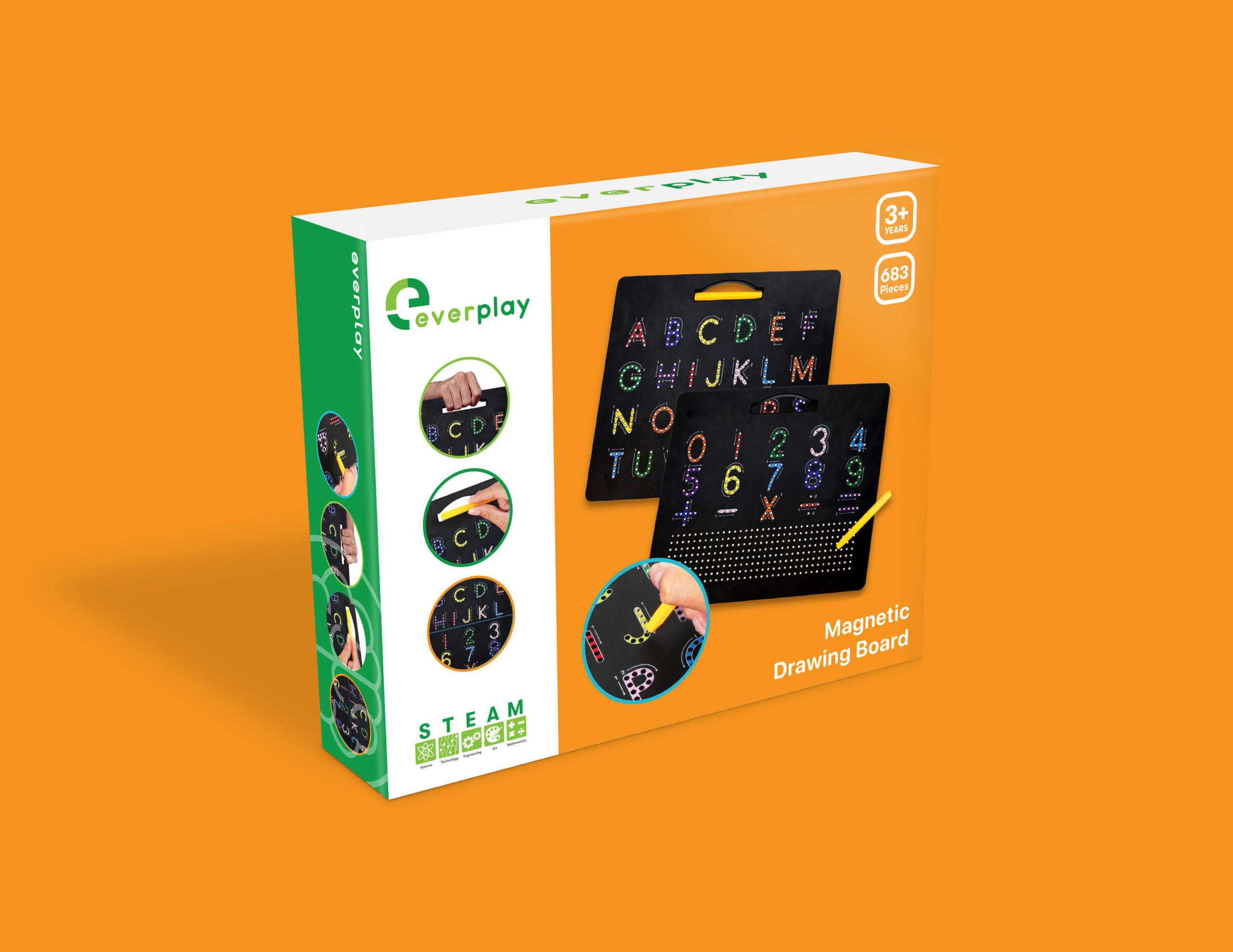
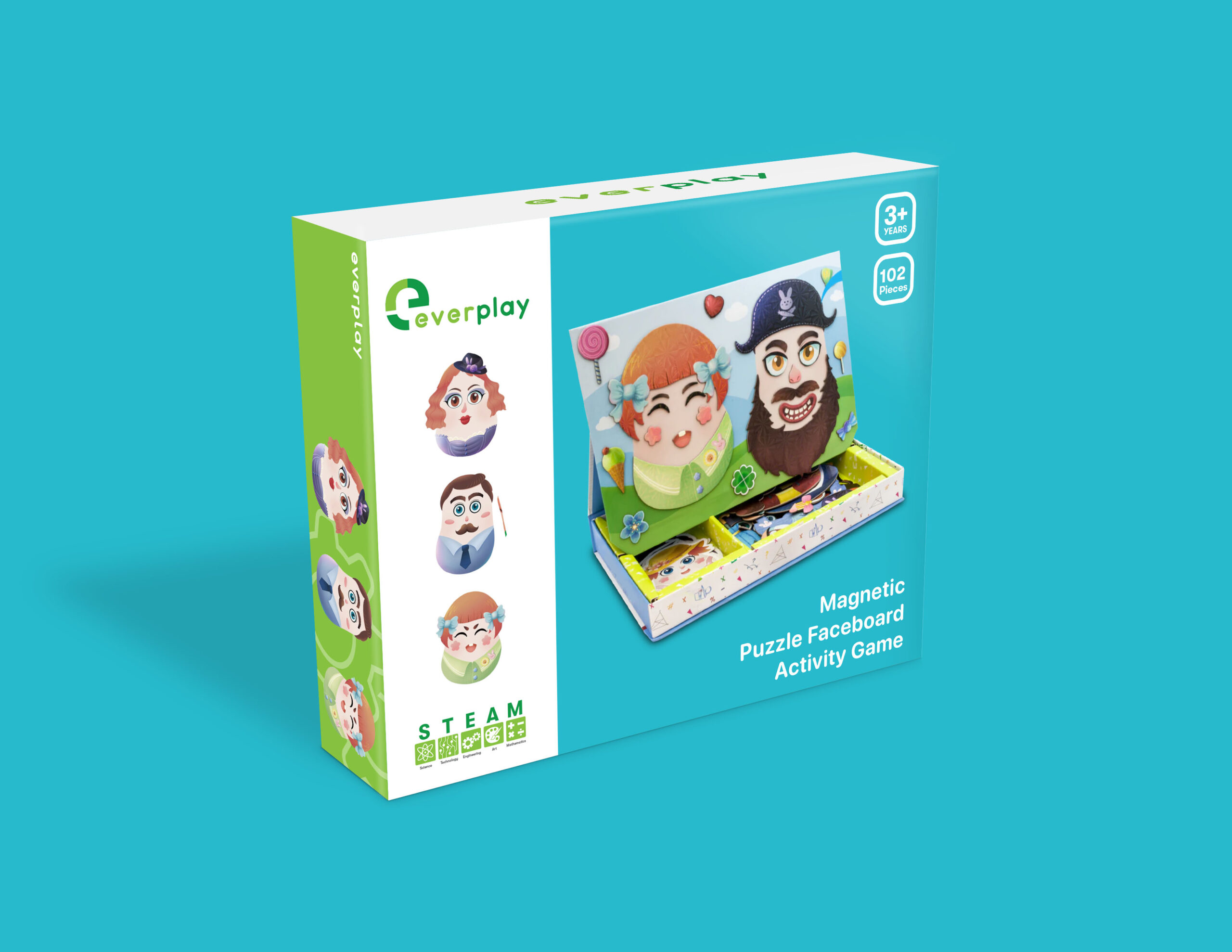
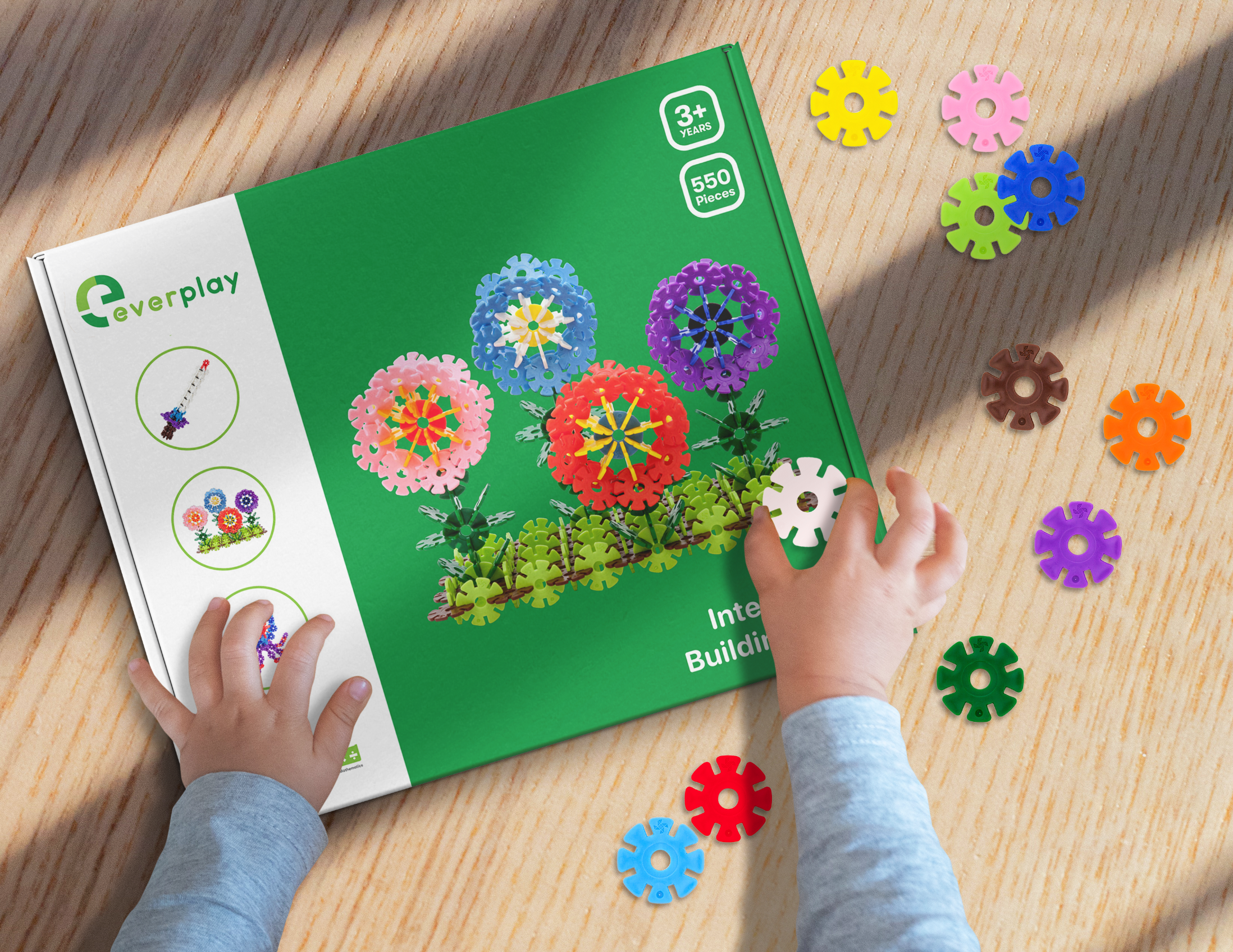
Packaging
TEAM
Lead Designer – Daniel Alonso
Creative Direction – Howard W.
Copywriter – Kevin L.
Contributor – David J.
Picassotiles
Picassotiles is a “shape building” set utilizing embedded magnetic tiles that immerses children, and creative adults into crafting 2D and 3D masterpieces.
Picassotiles needed to rebrand in order for the company to continue to grow. When the company first started, they were only selling magnetic tiles. As they grew, they wanted to incorporate other kinds of products and expand their toy collection.
problem
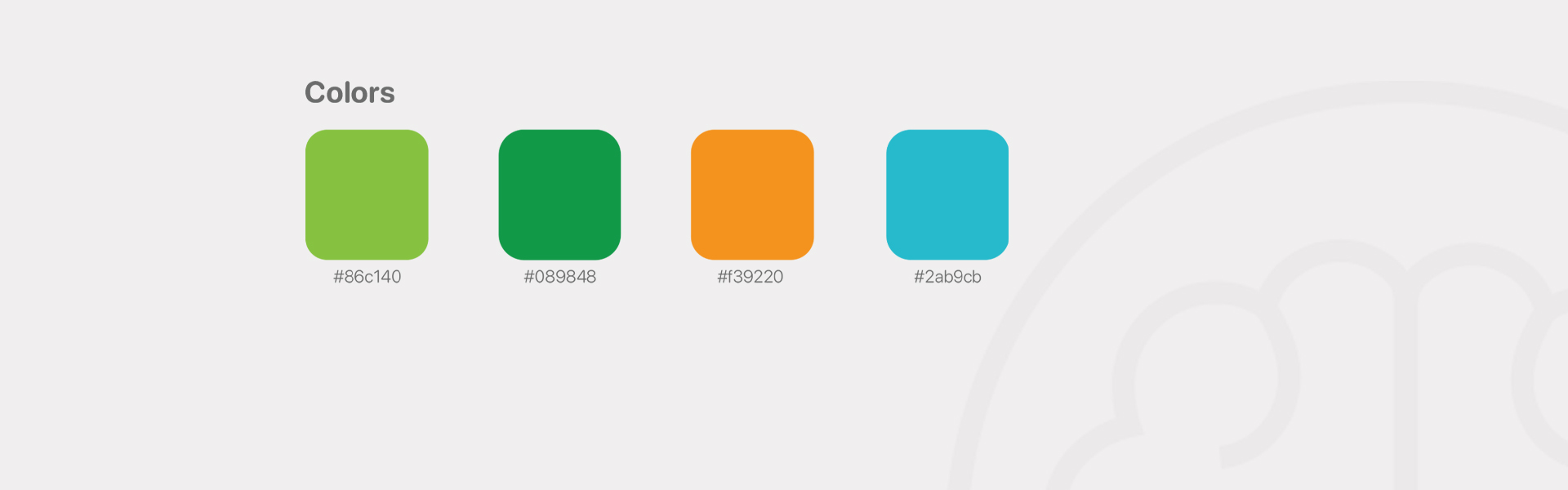
We have the word “tiles” in our company name. Our consumers don’t associate Picassotiles with other products other than magnetic tiles. And most of our product sales come from magnetic tiles. New product launches don’t sell that well as good as tiles do. Lastly, our logo is outdated and our color palette needs to be gender neutral. The vibrant and saturated color palette makes the brand look outdated.
solution
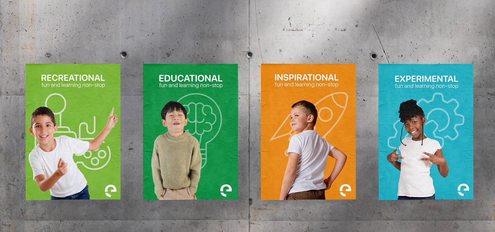
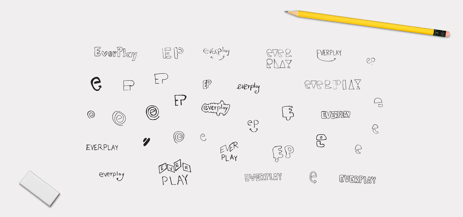
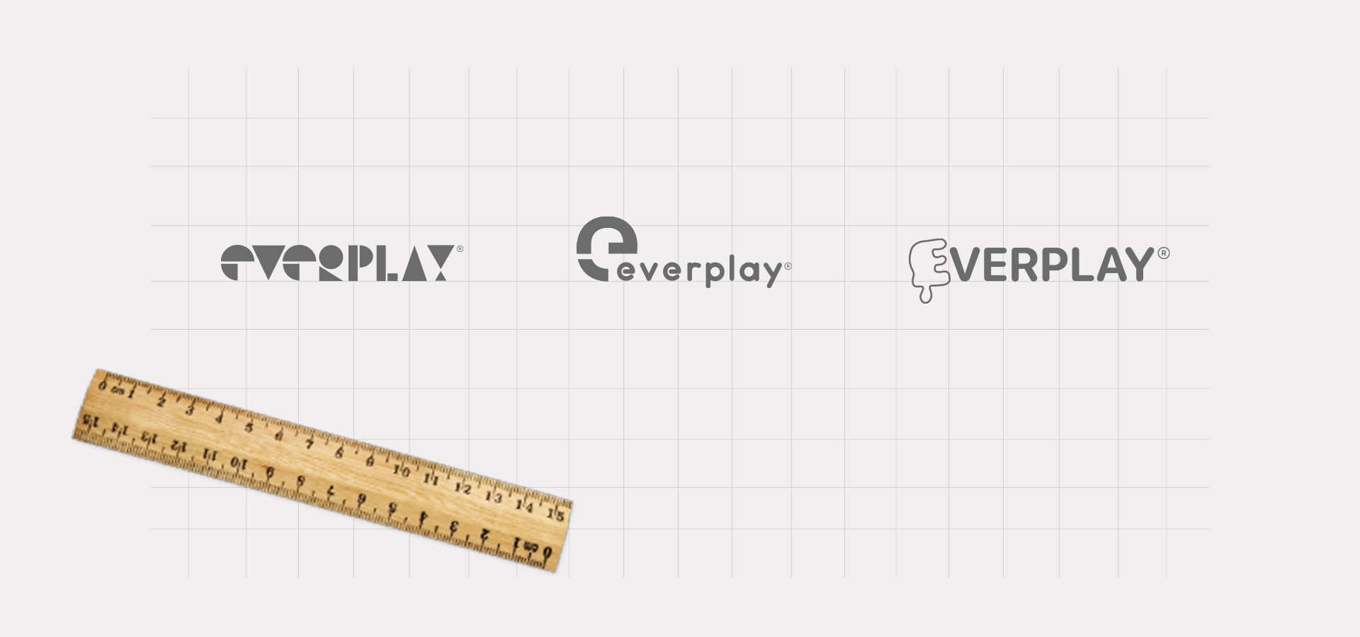
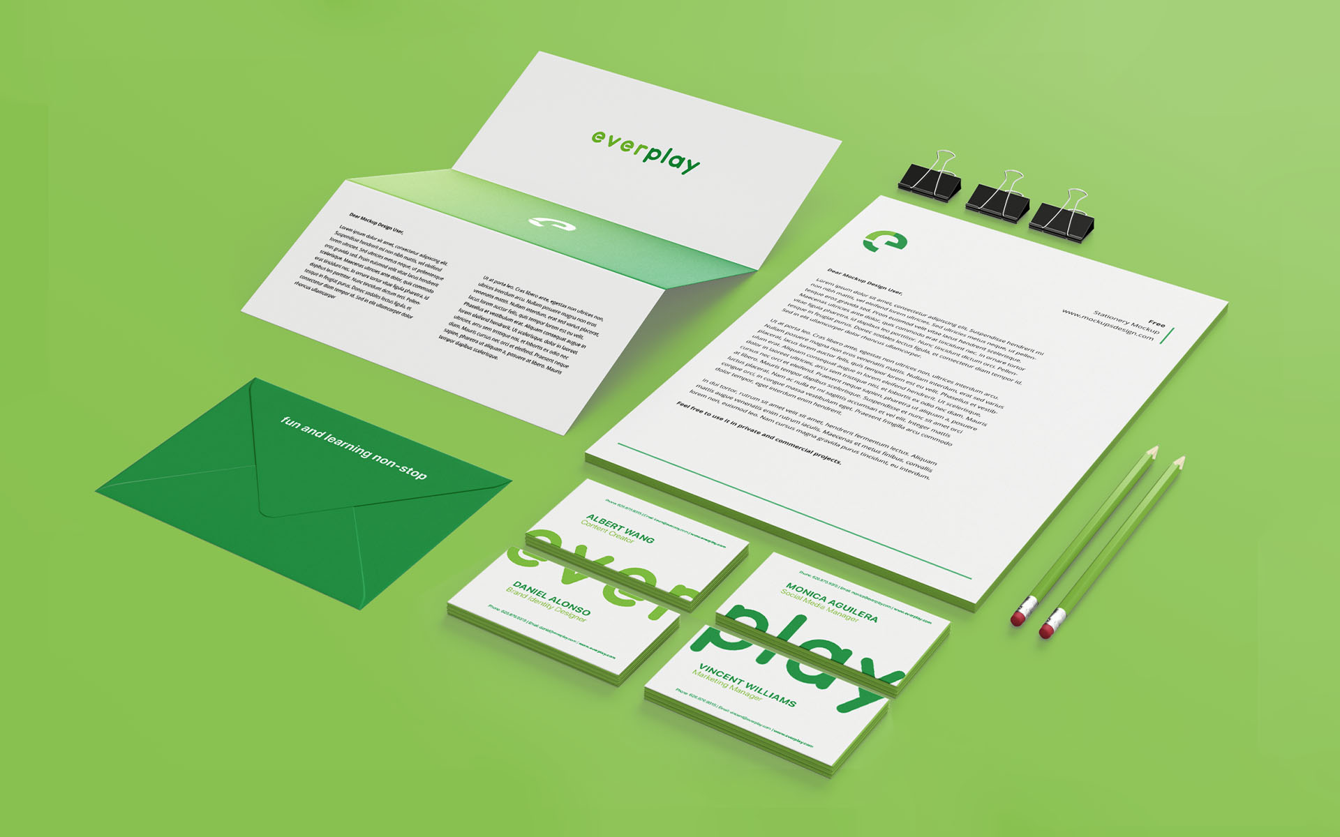
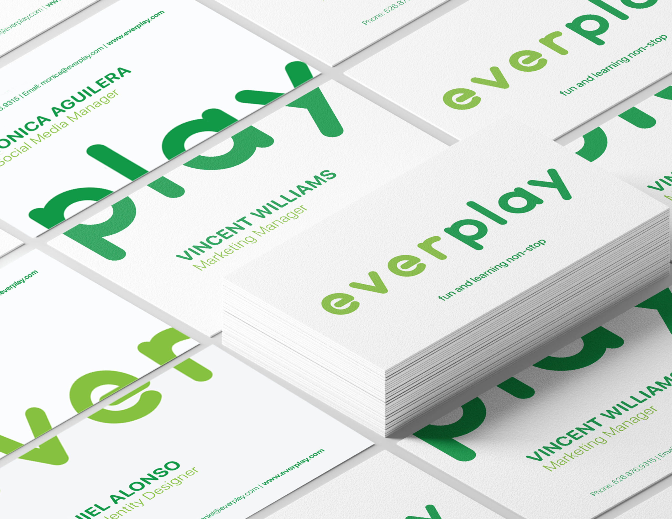
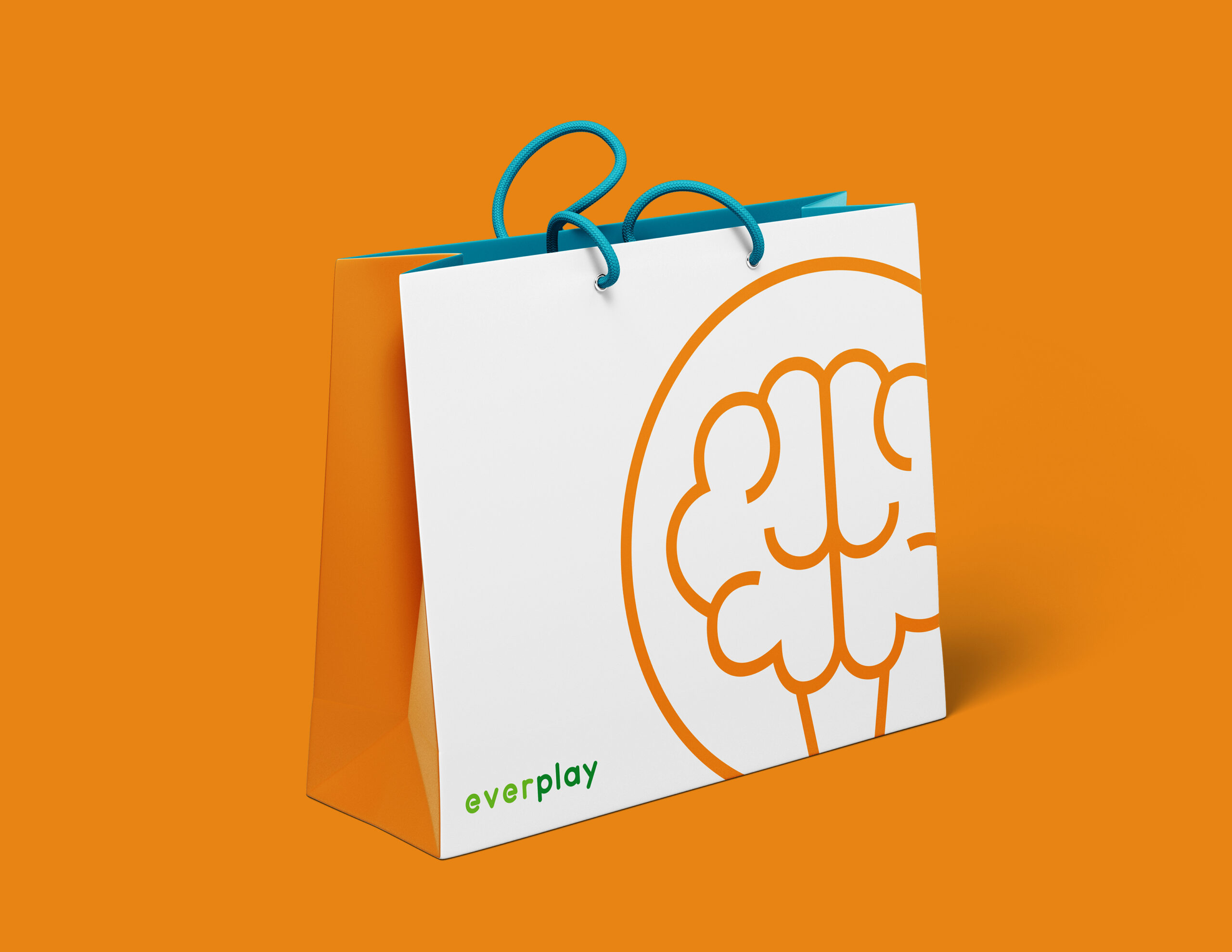
Everplay is a modern, minimal, and playful toy brand that embodies their passion for creativity and connectivity. Our logo uses a lowercase san serif font making the brand fun, friendly, and inviting. With three different logo variations that are unique and distinctive from our competitors. Our new four color palette is a combination of cool and warm colors and gender neutral. Green being the primary color, represents growth and renewal, as well as being associated with taking action. A perfect color to represent a growing brand and a fresh start.